Redesign the front-end e-commerce application @ 1001pharmacies
| Client | 1001pharmacies.com |
| Project | E-commerce redesign |
| Project date | Summer 2017 |
| Project duration | 6 months |
| Project URL | https://www.1001pharmacies.com |
| Role | UX designer & Front-end developer |
| Responsabilities | UX Designer (personas, wireframe, usability tests) & Front-end developer (HTML, Sass, Javascript) in a Scrum Agile team |
| Technologies used | HTML5, Sass, Javascript, Webpack, PostCSS |
| Library/Framework | Symfony 2, ITCSS, LEAN UX |
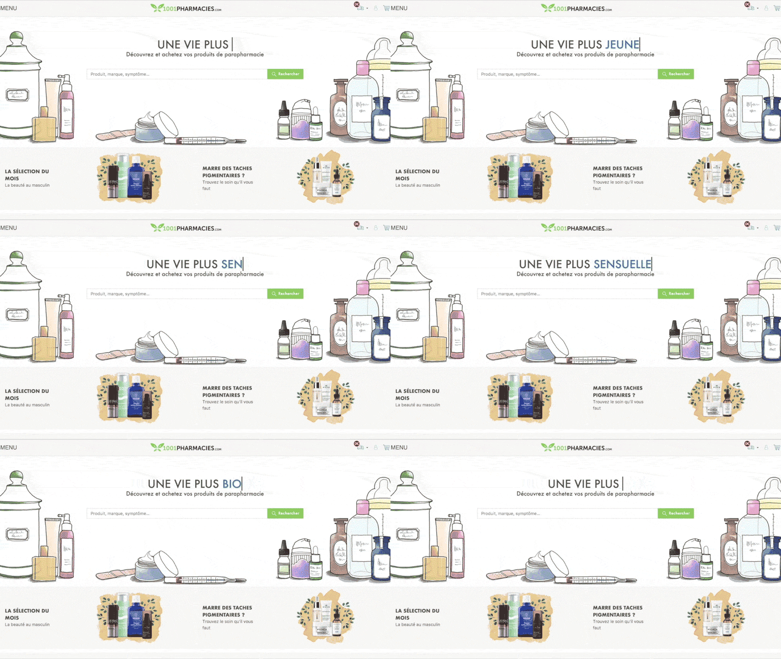
1001pharmacies.com is an online marketplace in the health and well-being activity. Its purpose is to connect pharmacists directly with their customers through an access to their products online. Each pharmacy can manage its own drugstore catalog and its stock.
This project was initiated in order to improve performances, usability and overall user experience of the front-end e-commerce application.
Team
This project was the second implementation of an Agile Scrum workflow.
Thanks to the previous experience gained with the checkout redesign project, we were able to better and faster tackled each problematics we’ve encountered.
The team that worked on this project consisted of 8 people. A product owner, a scrum master, 3 back-end devs, a creative director, a front-end dev bud and myself as front-end dev & UX designer.
Problem
The previous front-end application of 1001pharmacies.com was old fashionned, lacked of brand identity, had poor performances and shown during usability tests that users had an hard time figuring out how to find products.
The code architecture was also clunky and was causing a lot of maintenance time #spaghettiCode. Technically speaking, the website was running on a monolithic code-igniter core which was encapsuled in a Synfony 2 module.
As 1001pharmacies.com traffic and revenue was rapidly increasing (1M views each month), it had become essential to redone the website in order to substain growth.
Approach
The team’s approach was to clarify the navigation, start from scratch by stycking only to the core features of an e-commerce website :
- Search for product (via a search bar or through categories/brands listings)
- Find it (product listing)
- Evaluate it (product page)
- Add to cart (call to action)
- Make an order and/or continue shopping (checkout process)
We would release this build as an MVP and then iterate on it to add more complex features (eg: filters, product recommendations, …).
I was personnaly rattached to the first iteration of the redesign. A new team is now working on the following of this project.
Roles and process
This project was an occasion for me to experiment a lot of different aspects of my skills.
My main role was to lead the UX team :
Composed of the Creative Director, the Product owner and during some sprint the Director of digital marketing.
- Prepare and perform users interviews
- Create personas and present them to the rest of the team.
- Provide design studio workshops (an UX method) to help the team during ideation loop
- Wireframing
I was also teaming up with my buddy @iTweetScor to write the front-end chunks of code :
- HTML5
- CSS (Sass)
- Javascript ES6
- Twig (Symfony3)
Finally, I helped to design the UI with the Creative Director by sharing the user point of view (UX advocacy).
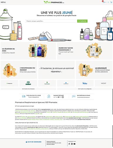
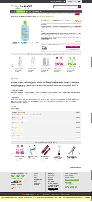
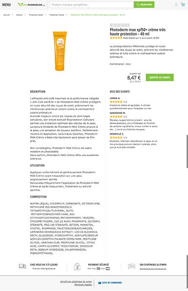
Some result screenshots
Before
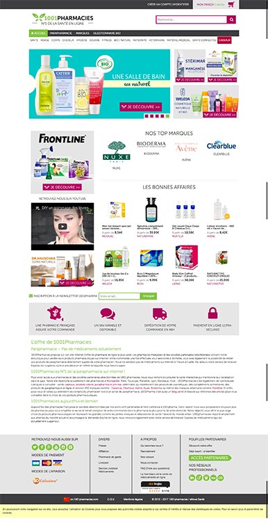
After
