 Mathieu Fortune
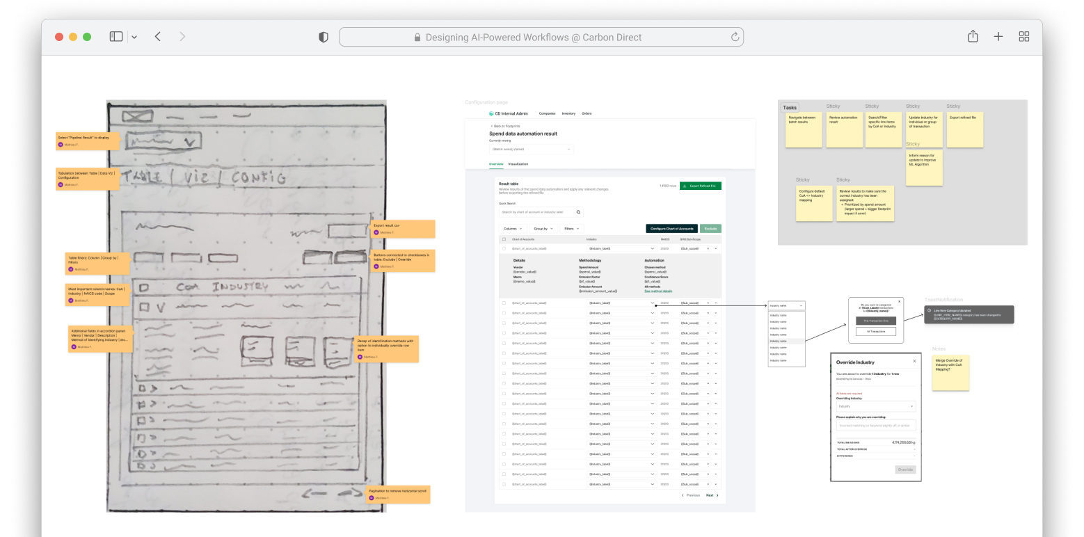
Human-in-the-loop AI for carbon accounting: automating Scope 3 emissions at Carbon Direct
Carbon Direct helps businesses and governments measure, reduce, and remove their carbon emissions. When I joined, calculating spend-based Scope 3 emissions consumed half the time needed to produce a customer’s carbon footprint. Engineers had built a machine learning proof of concept, but its error rate was high and it had almost no UX.
As Senior Product Designer, I owned the end-to-end design of a new workflow that paired AI categorization with a correction tool where every analyst fix trained the model. Data ingestion got 15% faster and manual corrections dropped 20%.
Context
Half of every carbon footprint went to one step
Carbon Direct provides science-backed carbon management to Fortune 500 companies, high-growth startups, and heavy industries. These customers use their carbon footprints for reporting, compliance, and decarbonization planning, so the numbers have to be right.
The most demanding step in producing a footprint was Scope 3 spend-based accounting: take a customer’s spend data, assign each line item a NAICS industry code, and apply the matching emission factor. The spend files arrived messy and held thousands of line items. Coding them correctly took domain judgment, backed by EPA guidance and the GHG Protocol. When I joined, this one step consumed 50% of the total time needed to produce a footprint.
Engineers had built a proof of concept that used large language models and machine learning to automate parts of the process. It showed promise, but the error rate was high enough to require extensive manual review, and the UX was almost nonexistent.
The project had two objectives: make the workflow faster and more intuitive for the carbon accountants and analysts who used it every day, and refine the automation so it could learn from their corrections. The end goal was to free the internal team for higher-value work and lower the cost of processing data.
Discovery
Mapping how carbon accountants actually worked
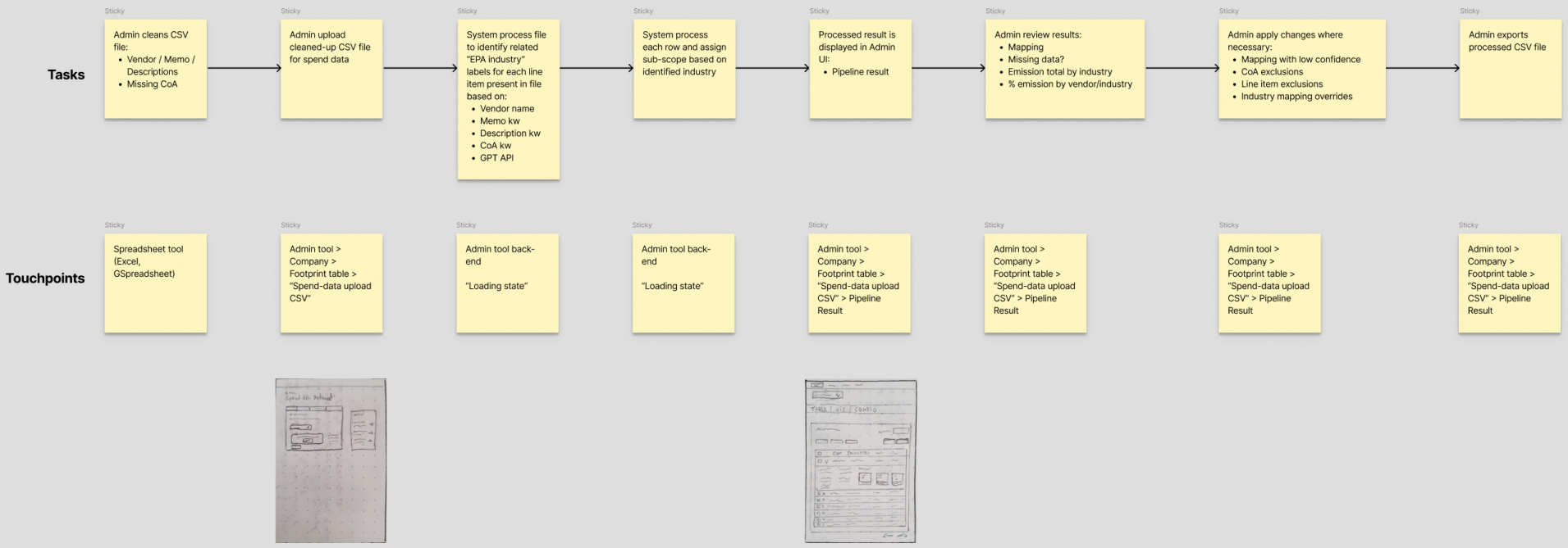
I started by interviewing carbon accountants and data analysts and walking through their workflow step by step. I documented the current flow in Miro, flagged the areas causing the most friction, and linked early sketches directly to the map so the team could react to ideas in context.
This phase was also where I learned the domain. Carbon accounting was new to me, so I read EPA guidelines and the GHG Protocol and leaned on subject matter experts to check my understanding. I needed that base to design anything useful. I couldn’t simplify steps I didn’t understand.
Process
Design the ideal, then cut ruthlessly
With the current state mapped, I wireframed an ideal-world solution: a multi-step process that connected existing UI components in a more efficient and intuitive way, without worrying yet about what we could ship first.
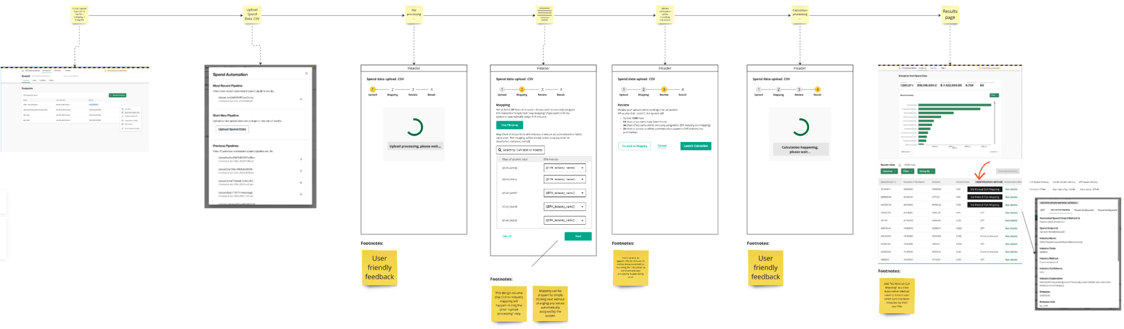
After gathering feedback on the wireframes, I designed a high-fidelity version of the strongest concept. That gave the team something concrete to align on.
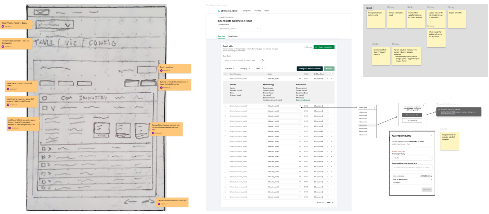
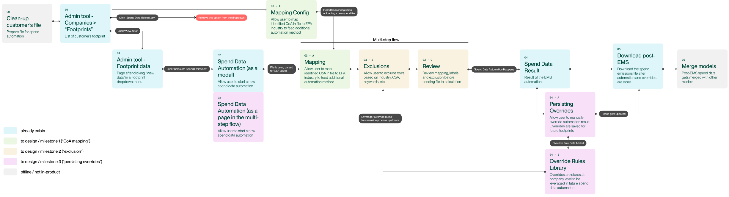
The ideal version was too big to build in one go, so I drew a flow diagram of the improved workflow and split it into prioritized milestones. The diagram made feedback easier to collect and gave stakeholders a clear picture of what would ship when.
Solution
A workflow where every correction trains the model
The shipped design follows the data through three stages.
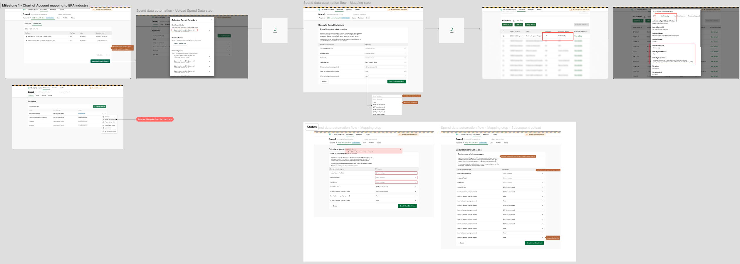
Ingestion and cleanup. A multi-step flow with CSV templates, mapping functionality, and formatting tools turned messy spend files into clean, structured data. Visual tables showed the results of each automated step, so analysts always knew what the system had done. This removed most of the manual prep work.
AI categorization. Large language models assigned NAICS codes to each spend line item, using the chart of account categories already present in the raw data. Analysts no longer had to code thousands of lines by hand.
Correction with a feedback loop. This was the heart of the project. I designed tables and forms where analysts could review the AI’s categorization and fix what it got wrong. Every correction fed back into the ML model, so the same mistakes showed up less often over time.
To validate the design, I turned the high-fidelity UIs into a simple Figma prototype, ran usability tests with the internal team, and handed the finalized flows to engineering with detailed specifications.
Three challenges ran through the whole project.
Earning trust
The design team had just been restructured and leadership wanted results. I delivered in small increments and tailored my communication to each stakeholder.
Learning carbon science
Footprint reporting demands scientific rigor. I studied EPA guidelines and the GHG Protocol and worked with subject matter experts to keep the designs accurate.
Learning ML
How the model would interact with spend data was unclear at first. I learned the basics of ML with the engineers so I could design a workflow the model could actually support.
Outcomes
What the automation moved
50%
of footprint time
went to this one step before the redesign
+15%
faster data ingestion
through automated prep and cleanup
-20%
manual corrections
as the model learned from analyst fixes
The redesigned workflow also gave the internal team a process they could trust and build on. Leadership pointed to the project as proof of what the restructured design team could deliver.
Reflection
Designing for humans and machines
I had to learn two hard domains at once, carbon science and machine learning, then design a workflow that experts could trust. The experience convinced me that the best AI workflows keep people in charge. The model does the repetitive work, and the experts stay in control of the results.
Two years later at Jewelers Mutual, I took this work further and used AI to build an interactive prototype without engineers.
The analysts were not cleaning up after the AI. They were training it to need them less.