 Mathieu Fortune
Modernizing Mentor Collective's SaaS Platform
Mentor Collective helps higher-ed institutions run student-centered peer-mentorship programs. Its SaaS platform lets partners, the university administrators who run these programs, manage initiatives and track student outcomes, but rapid growth had outpaced a dashboard originally built as an MVP by an outside contractor.
As Senior Product Designer, I led the end-to-end redesign of the partner experience, from research through developer handoff, anchored in a design system I had recently championed. The team launched a beta in January 2022 and shipped the full release that April, delivering a more accessible, self-serve platform that grew monthly active users by 116% and feature adoption by 136% year over year.
To comply with my non-disclosure agreement, I have omitted and obfuscated confidential information in this case study. All views expressed are my own and do not necessarily represent those of Mentor Collective.
Context
A dashboard that outgrew its MVP
Mentor Collective empowers higher-ed institutions to build equitable, student-centered communities through a peer-mentorship platform. Partners, the university administrators who run these programs, use it to manage mentorship initiatives and surface insight into student needs at pivotal academic moments.
The original partner dashboard had been built as an MVP by an outside contractor in the company’s early days. As Mentor Collective scaled, that foundation started to show its limits as three pressures converged.
Scalability
The dashboard needed both performance and feature upgrades to support a fast-growing user base.
Accessibility
Meeting WCAG AA was essential to a universally usable, enjoyable experience.
Insight gaps
Analytics captured only basic session data, leaving us blind to real user behavior.
That last gap mattered most. For a data-driven team, the lack of visibility into how partners actually used the product made it hard to design with confidence. Closing it was the first order of business.
Discovery
Listening to partners and the people who serve them
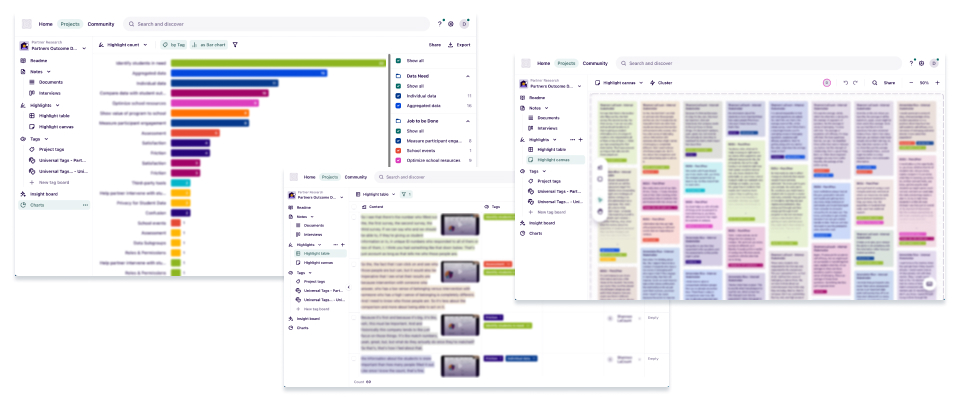
I started by investigating what partners actually needed. Working with our UX researcher, I wrote an interview script and reached out to key users. Landing partner interviews was difficult during the back-to-school crunch, so I interviewed two external partners and supplemented them with five internal account managers who work alongside partners every day. Using Dovetail, I documented, tagged, and analyzed the transcripts to surface recurring themes quickly and accurately.
Three findings rose to the top.
Barriers to data export
Partners couldn’t export dashboard data themselves; it ran through account managers, adding friction and discouraging logins.
No at-a-glance views
Partners needed quick snapshots to report upward, but only account managers could pull them.
Aggregated, all-time data only
Partners needed to see trends over time and by student demographic, not a single lifetime total.
Together these pointed to one shift. Partners wanted to manage their own mentorship initiatives directly, moving away from an account-manager-mediated model. The MVP’s reliance on account managers had served early needs, but growth demanded a more self-sufficient experience.
After reviewing the insights with my Product Manager, we framed a clear design objective.
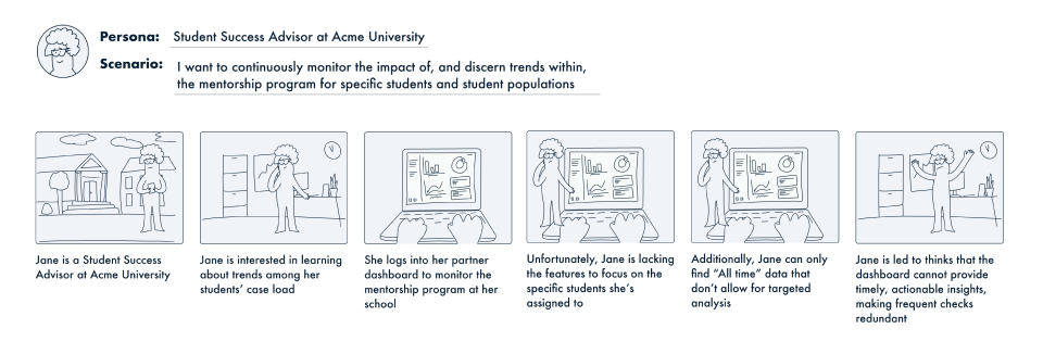
As a point person, I want to continuously monitor the impact of, and spot trends within, our mentorship program for specific students and student populations, so I can direct my support initiatives. Today, aside from student Flags, the dashboard shows mostly ‘all-time’ metrics for the whole program, so it rarely gives me timely, actionable insight and frequent check-ins feel redundant.
To rally internal stakeholders around this story, I built a storyboard dramatizing the partner’s pain point.
Process
From insight to ideation
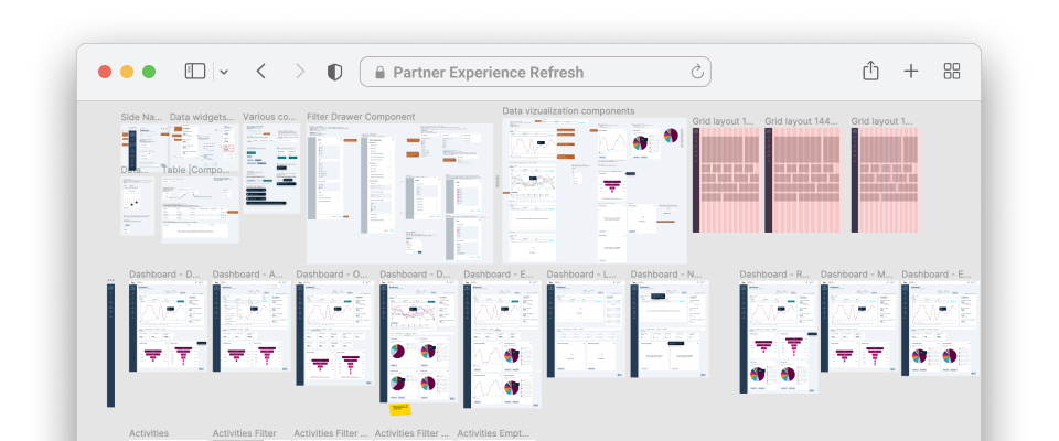
With the research in hand, I moved into design. I began by thoroughly auditing the existing product to understand its strengths and gaps. That groundwork was essential, since no one on the team had built it.
Next, I facilitated a remote brainwriting session in Whimsical using “How Might We” prompts. I deliberately invited a cross-functional mix of sales, account managers, engineering, and product, so the ideas stayed grounded in real user insight rather than any single team’s assumptions.
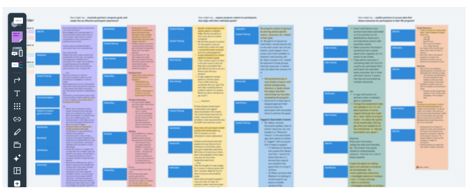
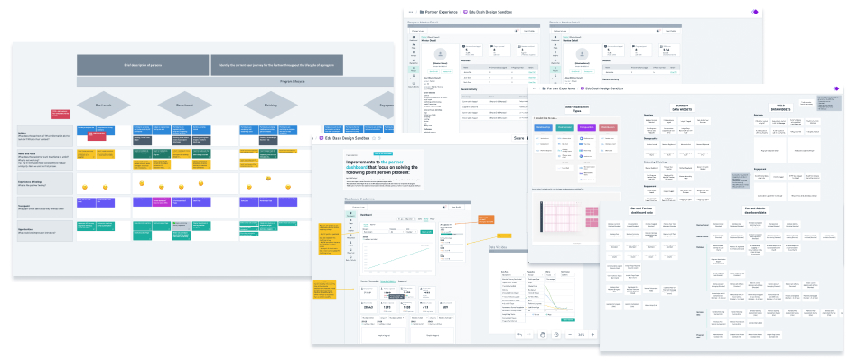
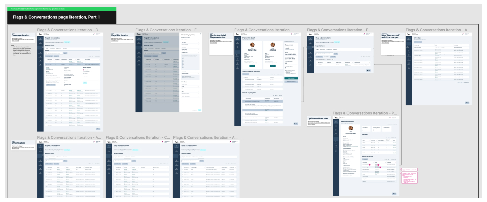
From there I moved into ideation and sketching. I mapped a user journey to frame the key tasks, then wireframed the new partner experience, guided by a few sharp questions. Which data points should we surface? How do we display them intuitively? What layout presents the information best? I iterated closely with my Product Manager and Lead Engineer in Whimsical throughout.
I then walked the wireframes back through the partners I’d interviewed. This confirmed our direction matched their reality and validated that the solutions resolved the pain points they’d raised.
Before moving to high-fidelity, I set three guiding principles.
- Keep it clean. A minimalist layout makes the data more accessible and leaves room to scale.
- Respect the user’s time. Research showed partners carry high cognitive load all day, so the design had to favor clarity and concision.
- Leverage the design system. Building on our new system bought accessibility, scalability, and faster implementation.
Solutions
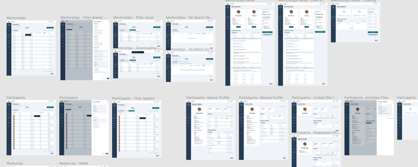
A modernized, self-serve partner experience
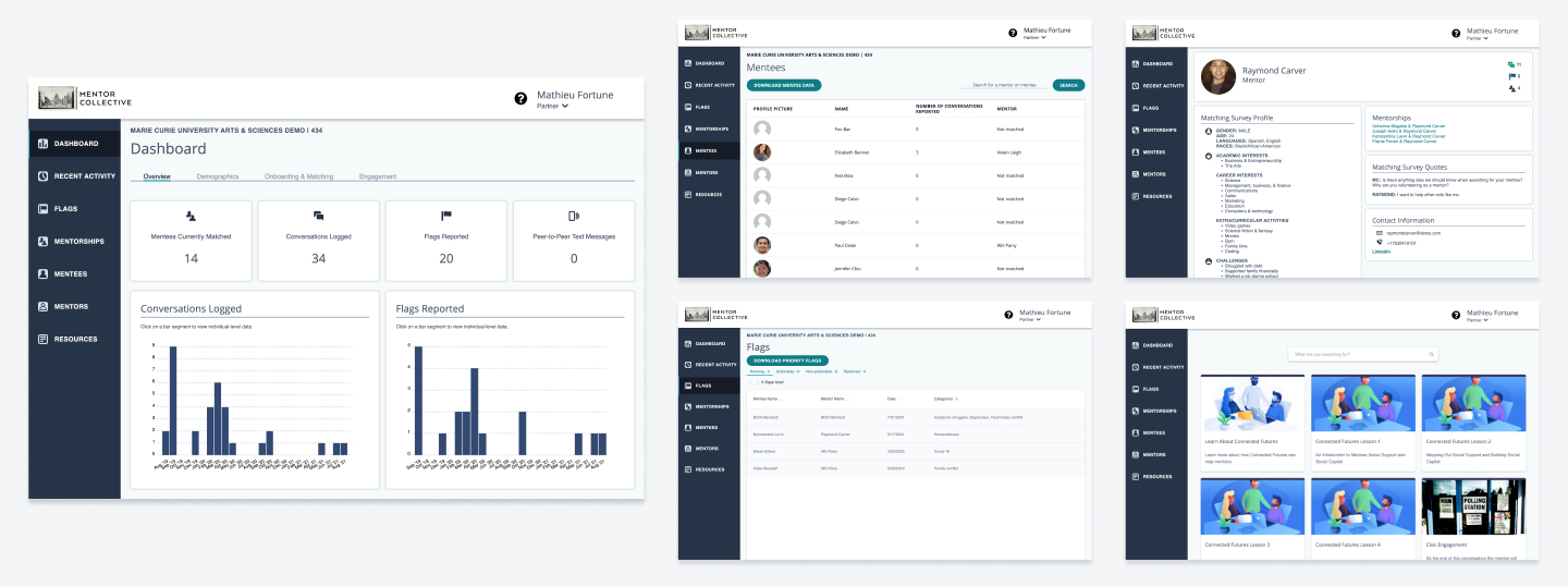
Here’s where the partner experience started. This was the dashboard before the redesign.
All the research and low-fidelity iteration converged into a set of accessible, user-centric solutions.
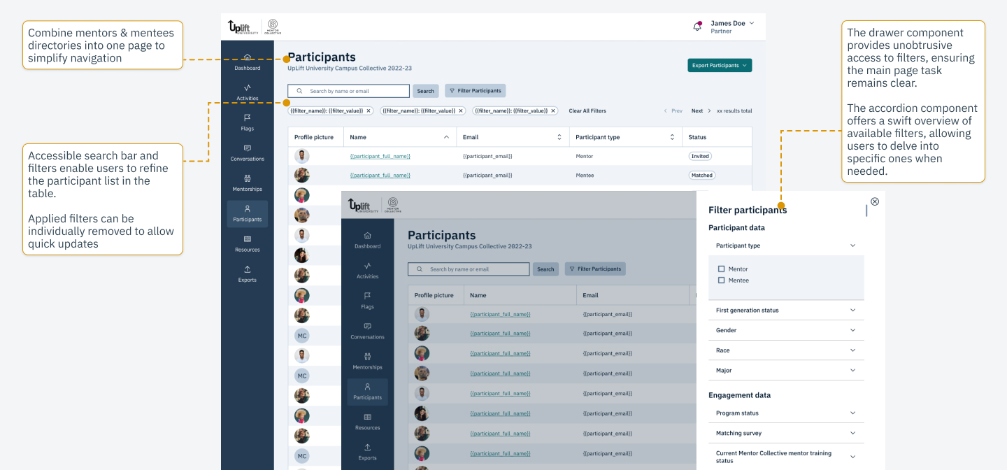
Program Intelligence Chart. Expanded the data surfaced on the dashboard and made it far easier to read at a glance.
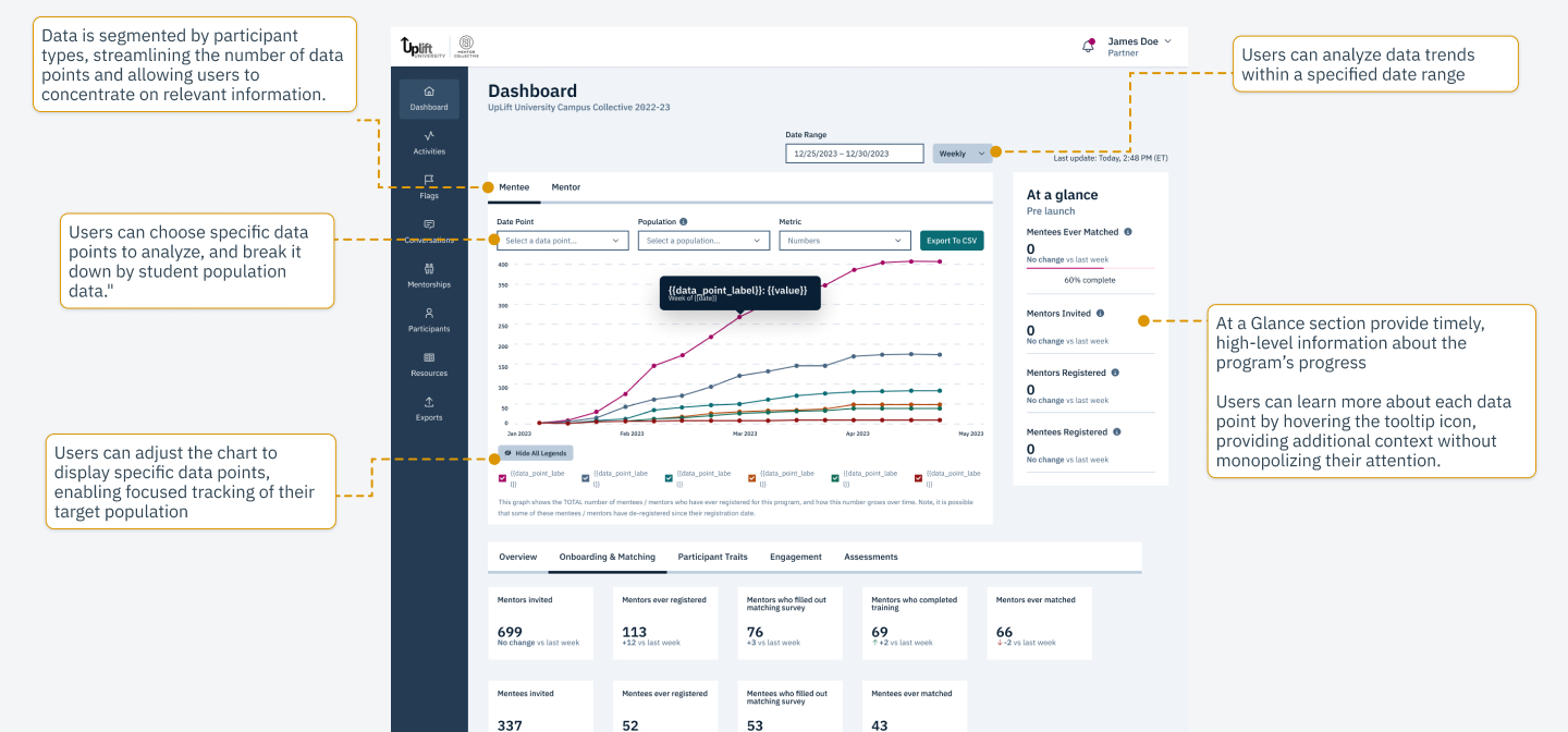
Filters and enhanced tables. Added filtering and data tables so partners could drill into specific student populations within large datasets.
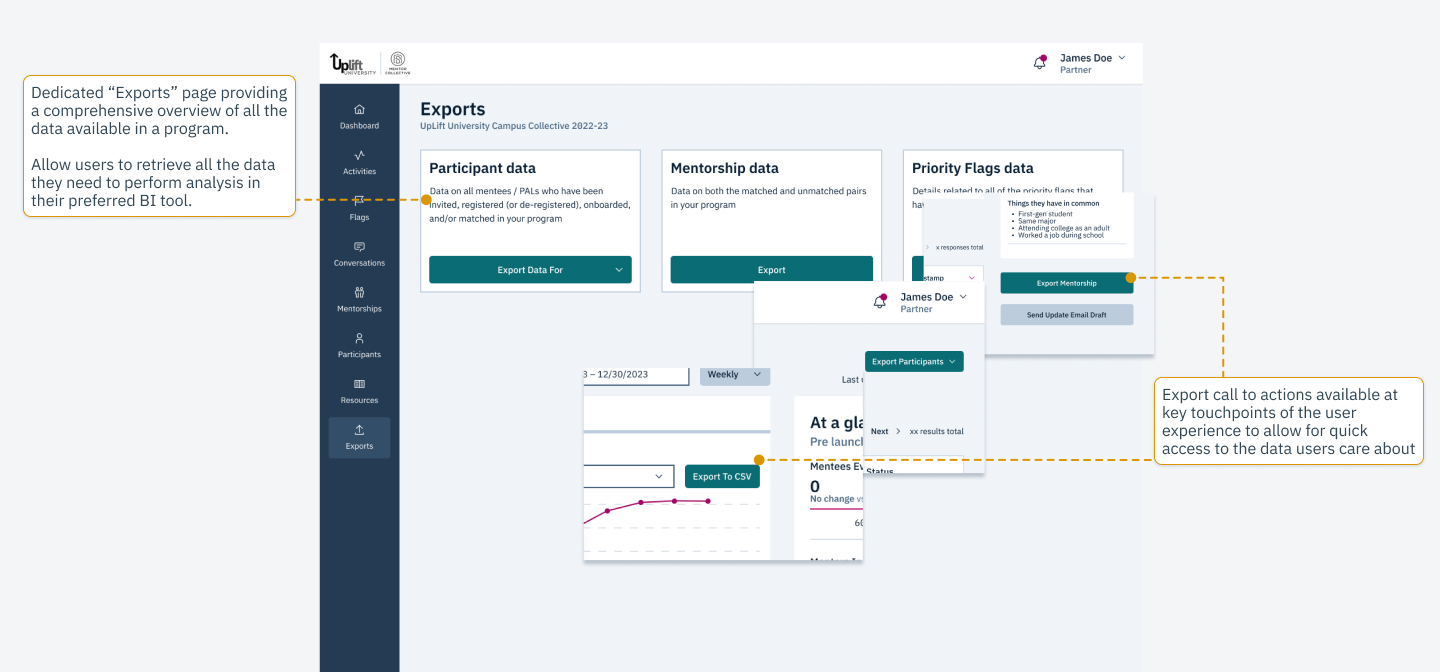
Export options. Introduced a dedicated Exports page and embedded export actions at the moments partners needed them.
Layout and navigation. Modernized the layout for accessibility and made it responsive to desktop and tablet, based on behavioral analytics data.

UI refresh. Updated the brand identity, redesigned the activities page, and added in-app notifications.
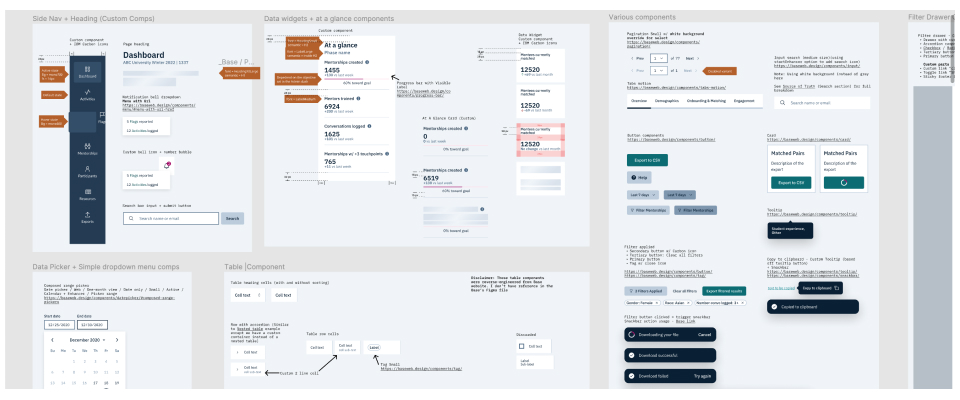
Throughout, I leaned on a design system I had recently championed at Mentor Collective, embedding its accessible color palette, typography, and layouts directly into the dashboard.

Handoff
Building and launching alongside engineering
With the high-fidelity designs finalized, I prepared a thorough handoff. It included a recorded video walkthrough, detailed annotations, and documented requirements, all housed in Figma and Asana for easy reference. Throughout development I worked closely with engineers to protect design integrity, functionality, and WCAG AA compliance, and ran QA passes on the builds.
The data visualization work threw the biggest curveball. Against real data, the charts needed adjustment to stay legible. My front-end background let me partner with engineering on quick, practical fixes rather than tossing the problem over the wall.
What sets Mathieu apart is his ability to be a creative thought partner when bridging the gap between design and engineering. He consistently engaged in productive dialogue with engineers to improve handoff and sprint workflows, and excelled at finding design workarounds to technical limitations — which makes him an invaluable asset to any project.
We launched a beta to a select group of partners so we could iterate fast on a complex release. Most feedback was minor, but one signal stood out: a revamped feature had drifted from a familiar workflow, increasing friction and errors. I reworked the navigation and re-validated it with stakeholders, sharply reducing errors before the full launch.
Outcomes
What the redesign moved
To measure impact, we instrumented the platform with Pendo.io and Hotjar and tracked NPS, monthly active users, feature adoption, session duration, and retention. The beta drew positive feedback from the start, and within a few months the data confirmed the redesign had landed.
+136%
feature adoption
year over year
+116%
monthly active users
year over year
+5 pts
NPS
rising into the world-class ~80 range
The qualitative feedback from NPS surveys painted just as vivid a picture.
Since working with Mentor Collective we're able to get those specific metrics and data, and we have the dashboard — which we absolutely love — to see exactly what's going on and tailor specific programs or initiatives to help students.
We can't underestimate the power of one person. It's been really exciting to see, through the dashboard and the Flags, just how powerful one mentor can be to a student and how impactful they can be.
Reflection
Collaboration was the through-line
Looking back, collaboration was what made this project work. Understanding our partners took coordinated effort across external users and internal stakeholders, and our UX researcher was instrumental in gathering the qualitative insight that grounded the redesign. Bringing sales, account management, engineering, and product into brainwriting produced richer ideas than any one team could have alone. In the design phase, tight feedback loops with my Product Manager and Lead Engineer kept the work aligned with what we’d learned. And in implementation, my front-end experience let me solve problems shoulder-to-shoulder with engineers instead of across a handoff wall.
Understanding, ideation, and execution were all driven by collaboration, and that through-line is what turned research into a platform partners genuinely wanted to use.
The redesign succeeded because collaboration ran through every phase, from understanding partners, to ideating with the whole team, to building it shoulder-to-shoulder with engineering.