 Mathieu Fortune
Championing the Design System at Mentor Collective
Mentor Collective helps higher-ed institutions run student-centered peer-mentorship programs across both B2C and B2B audiences. When I joined as its first design hire, the product’s visual identity and user experience were fragmented after years of contractor-led development.
I championed, built, and maintained Mentor Collective’s first design system, an accessible, React-friendly foundation that gave product and engineering a shared language. It standardized color, typography, data visualization, and components, brought the product to WCAG AA, and let the team ship consistent work as it scaled.
To comply with my non-disclosure agreement, I have omitted and obfuscated confidential information in this case study. Screenshots appear throughout for illustration and might not represent the final work. All views expressed are my own and do not necessarily represent those of Mentor Collective.
Context
A fragmented product identity
When I joined Mentor Collective, the product’s design and visual identity were fragmented. Through its early development years, the company’s story had been written by design contractors and product enthusiasts who weren’t strictly designers. The result was a product dotted with inconsistent user experiences and a visual identity that pulled in several directions at once.
I quickly saw the need for a design system that could create a unified voice and let us scale rapidly and efficiently. Mentor Collective was growing fast, and the product had to serve both B2C and B2B audiences. A design system would equip our product and engineering teams to handle the looming complexity, ensuring swift and consistent delivery of user value.
Discovery
Assessing our needs
I started by assessing what the Product team actually needed. Given the company’s mission to help millions of students and higher-ed administrators bridge the equity gap in post-secondary education, the priorities were clear.
Dashboards at scale
A robust dashboard design capable of handling large datasets, so higher-ed administrators could do their work.
Mobile-friendly
A performant, mobile-friendly application to connect students and manage communities.
Accessible by default
A product that everyone can use, with accessibility built in rather than bolted on.
Another key step was aligning the design system with our engineering stack for smooth integration. I probed engineers for collaboration, and they shared valuable insight about the technology they were using and the workflows they were following. Finally, I folded in the recently hired Design Lead’s view of where the design team was headed, so the system would serve our future as well as our present.
Approach
Choosing a foundation
Creating a design system from scratch for both design and engineering is no small feat, so we chose to start from an open-source system that would give us a head start. To guide the search, I set a few principles.
- Seamless React integration, so the system fit our stack from day one.
- WCAG AA compliance across color and components.
- Figma friendly, so designers could move quickly.
- A focus on dashboard designs, the heart of our product.
- Works for both mobile and web use cases.
After review with the team, we landed on Uber’s Base Web. Its React-friendly nature paired with built-in accessibility made it stand out from the alternatives. Despite that solid technical foundation, we weren’t content with a simple adaptation of Uber’s visual identity, so I built our own design language on top of it.
Solutions
Building the system
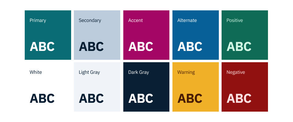
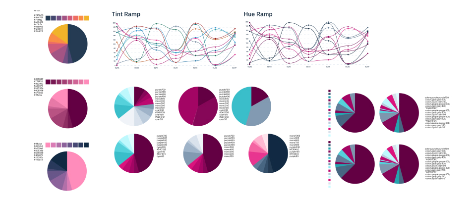
Colors. I introduced a color palette that aligned with Mentor Collective’s brand while emphasizing contrast, usability, and WCAG AA accessibility. To keep the palette flexible while designing, I segmented it into three categories, greys, primary and secondary, and supporting and accent colors, using HSL values to formulate each color ramp. To support the process, I leaned on EightShapes’ Contrast Grid and a colorblindness plug-in in Figma.
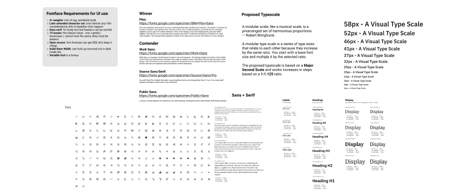
Typography. Next came typography. I tested different font families and typographic scales to make sure the product stayed accessible and usable on every device. I also researched and picked an icon library, IBM Carbon icons, that fit the new typographic style and suited our need for dashboard designs.
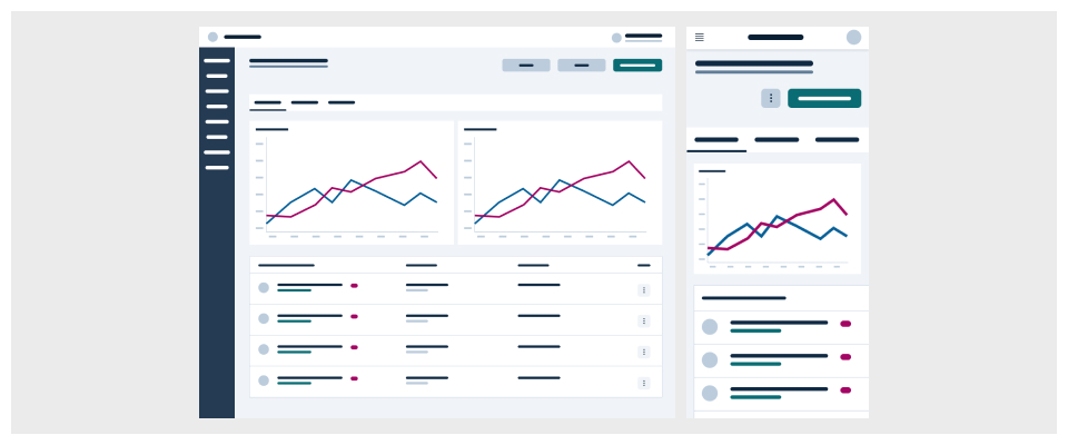
Data visualization. With the help of engineers, I picked a data visualization library, Airbnb’s VisX. I built out the chart types our product would need and tested their colors to guarantee accessibility compliance.
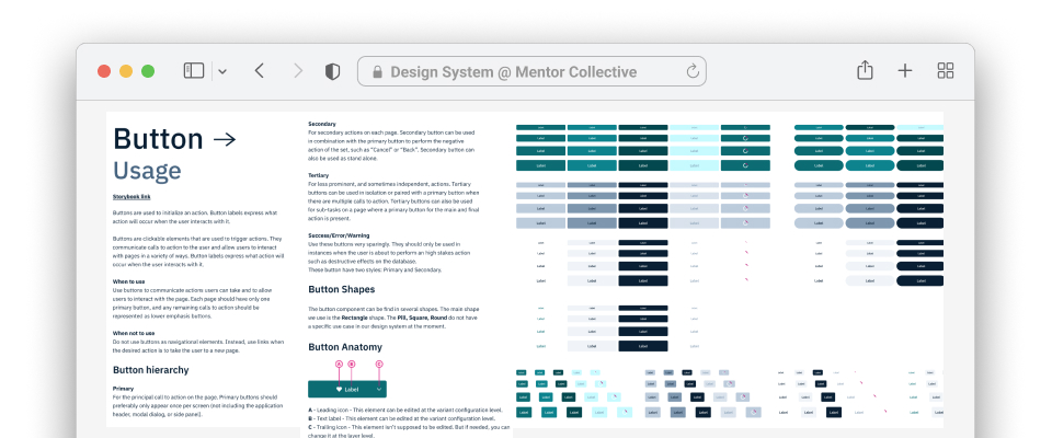
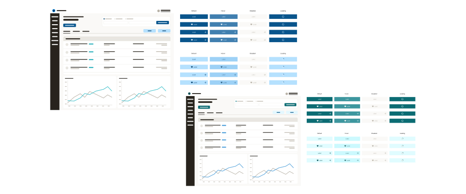
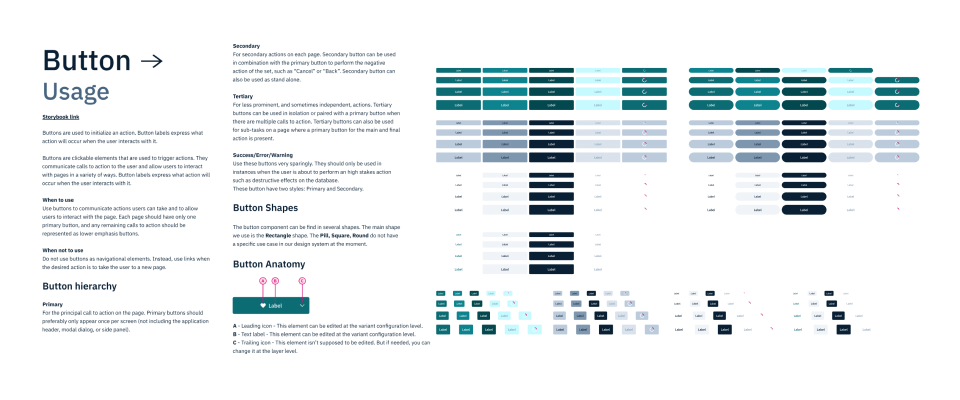
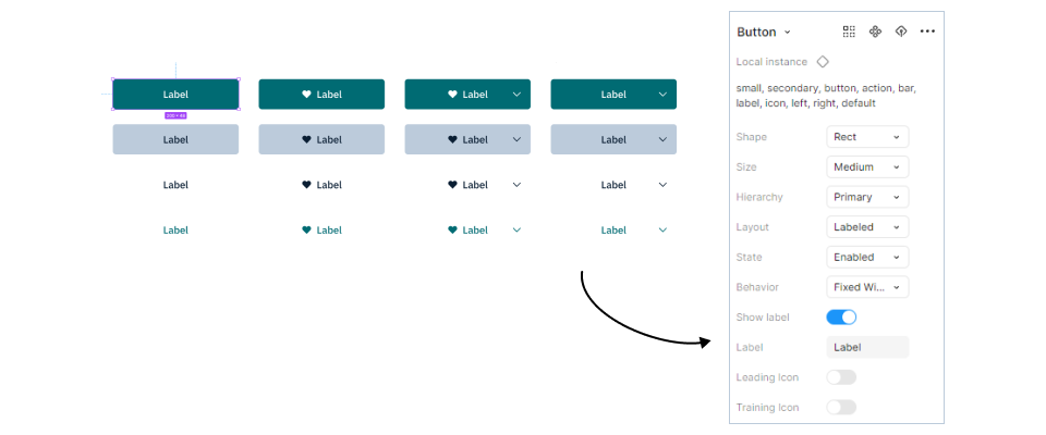
Components and usage rules. Beyond color and typography, I made sure every component fit our product by tweaking existing ones and creating new ones where needed. With feedback from the team and researched UX best practices, I iteratively documented usage rules for each component so they were intuitive and easy to adopt. To push usability and scalability further, I leaned on Figma’s variants and component properties to create flexible components. The buttons shown below, for instance, allow variations in size, hierarchy, state, layout, and icon placement, all within a single component. This streamlined design workflows, kept the product consistent, and let teams customize components without compromising design standards.
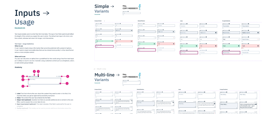
These improvements simplified the design process and empowered cross-functional collaboration. Designers, developers, and stakeholders could rely on a system that was robust yet adaptable to evolving product requirements. By fostering that collaborative approach, the design system became an integral part of product development, bridging gaps between design and engineering while preserving the visual and functional integrity of the product.
Adoption
Promotion and momentum
My engineering team was thrilled about the design system, but its realization was a collaborative effort. As Mentor Collective’s first design hire, I enjoyed a unique trust from the broader organization, which believed in my ability to put the right tools in place to scale the company’s product.
Throughout the build, I regularly held presentations and rubber-ducking sessions, briefing teams on our milestones and offering hands-on tutorials, especially on Figma for developers. Challenges came up during technical implementation, but I worked through them with close-knit engineering teamwork and careful quality control on our projects.
Keeping the system updated and relevant was vital to its long-term success. Alongside a few engineers, we set up a Frontend Guild at Mentor Collective. This group ran monthly discussions about the system’s evolution based on product squads’ needs and challenges, and it became the nexus for feedback, critique, and growth of the design system.
Impact
What the system changed
The new design system transformed Mentor Collective’s design narrative. It paved the way for consistent product roll-outs even as the team expanded. Two testimonials capture the shift.
One of Mathieu's most impactful early contributions to the team was collaborating with engineering to establish a thoughtful design system... This new design system was quickly used to redesign a highly visible dashboard... and saw a notable increase in visitor engagement after launch.
Mathieu championed the need for a more modern design system... The look and feel of the Mentor Collective platform, and the ability to scale it up, is a direct result of Mathieu's efforts.
Reflecting on the first project where it shipped, the design system’s influence was clear. It streamlined processes and decisions, and it ensured a cohesive visual narrative across a growing product.
Reflection
Adoption over artifacts
Looking back, the build itself was only half the work. A design system earns its value when people actually reach for it, so the presentations, the Figma tutorials for developers, the rubber-ducking sessions, and the Frontend Guild mattered just as much as the color ramps and components. Championing adoption and maintaining the system over time is what turned a library of tokens and components into Mentor Collective’s shared design language.
A design system isn't the artifact you ship, it's the shared language people keep reaching for. Adoption, not assets, is what makes it real.