Reimagining MoGraph Mentor's Online Presence
Overview
MoGraph Mentor is an online motion graphics school that redefines traditional arts education. Through on-demand training and personalized mentorship, the platform empowers artists with the tools they need to advance their careers.
When I joined MoGraph Mentor in late 2018, it was a passion project initiated by my business partner. Despite its early successes, the company lacked the infrastructure to scale and compete effectively in a rapidly growing market. To realize its full potential, we needed to transition into a scalable startup with a clear mission and vision.
Our shared goal was ambitious: revolutionize motion design education by building an accessible, innovative learning platform that equips artists with practical skills and opens doors to new career opportunities.
Roles
I wore multiple hats throughout this project, acting as Product Manager, Product Designer, Web Developer, and Product Marketer.Skills
Uuser research, competitor analysis, data analysis, wireframing, prototyping, high-fidelity visual design, usability testing, product marketing, and cross-functional communication.Tools
Sketchbook + pencil, Figma, Adobe Creative Suite, HTML/CSS, Google Analytics, HotJar.Timeline
6 weeksDeliverables
As we refined our business strategy and marketing plans, it became evident that MoGraph Mentor’s brand identity and digital presence required a complete overhaul. This created a pivotal opportunity to redefine how the company positioned itself in the market.
The project centered on two key initiatives:
-
Revamping the Company Website: The goal was to redesign the website as a user-friendly marketing hub and e-commerce platform. It needed to support growth goals, boost user engagement, and accommodate the planned expansion of the course catalog.
-
Refreshing the Brand Identity: I developed a cohesive brand identity that captured MoGraph Mentor’s vision and mission. This included refreshing the logo, curating a distinctive color palette and typography, and creating comprehensive brand and visual design guidelines to ensure consistency across all touchpoints.
The Challenge
Two significant challenges defined this project:
-
Overcoming legacy limitations: The existing website was outdated and lacked the robustness needed to support ambitious growth plans. Its limited capabilities caused bottlenecks, making a complete rebuild essential.
-
Navigating a competitive landscape: The motion design industry is vast and competitive. Differentiating MoGraph Mentor required deep insights into our target audience—their aspirations, challenges, and motivations. This understanding needed to inform both the brand identity and website redesign to ensure they resonated with users.
Addressing these challenges required strategic thinking, collaboration, and a commitment to aligning our vision with the needs of motion designers.
Final Product
Comprehensive Digital Presence
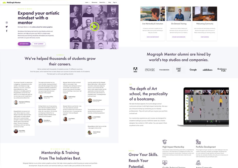
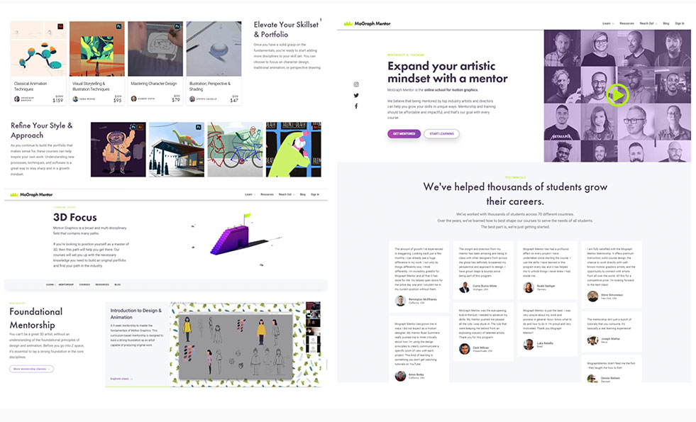
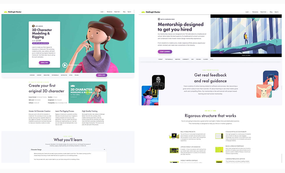
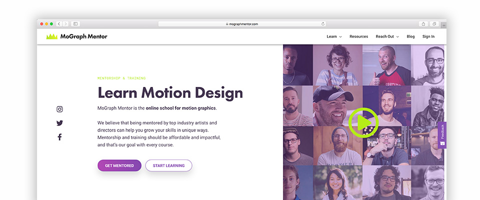
I developed a high-performance, responsive marketing and e-commerce platform. This website became the foundation of MoGraph Mentor’s business growth, offering a seamless user experience while effectively showcasing the brand and its offerings.

Brand Identity Guidelines
The refreshed brand identity differentiated MoGraph Mentor in a crowded market. I designed a new logo, refined the color palette, and selected complementary typography. These elements were compiled into a design system to streamline future improvements and facilitate collaboration with team members.
Design Research
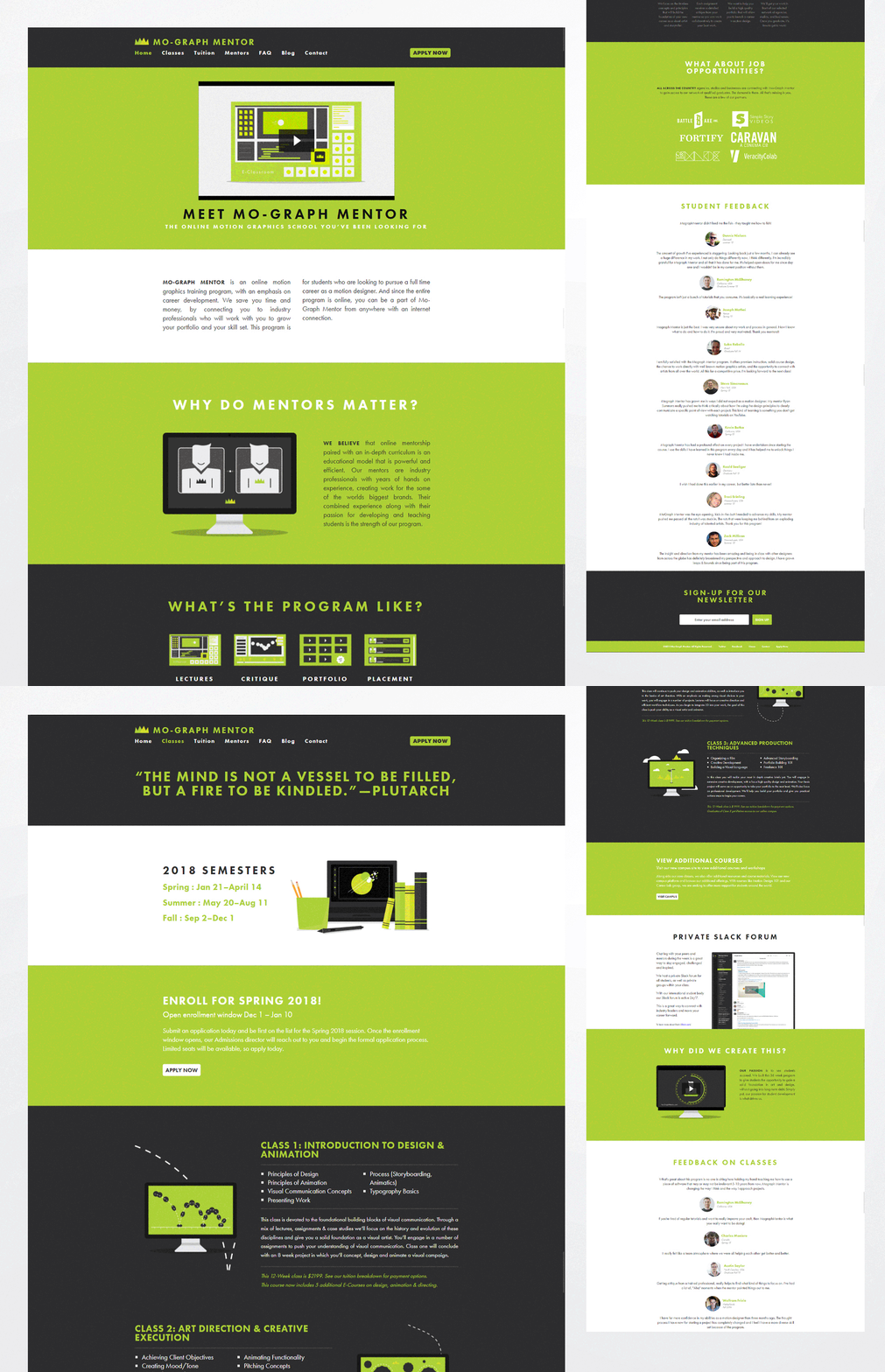
Audit revealed content organization and navigation issues
The original website suffered from an outdated design, accessibility issues, and defective navigation. It lacked SEO optimization, had poor image performance, and failed to effectively guide users to key pages like course sales. These shortcomings highlighted the urgency of a redesign
Industry & Market research led to important discoveries about how the motion design industry operates and the current state of online education for motion design
Through in-depth industry and market research, I uncovered key insights into how the motion design industry operates and the evolving landscape of online education within this field. The motion design industry was projected to grow rapidly, reaching $72 billion by 2022. This growth was fueled by recent technological breakthroughs, surge in computing power and increased demand for motion design across three major segments: video games, movies, and consumer products.
One key finding was the significant shift in the job market. Traditionally dominated by freelancers, the industry was experiencing a surge in in-house opportunities as companies began to recognize the value of having motion design expertise integrated into their teams.
These insights validated our approach to democratizing access to industry experts. By connecting aspiring motion designers with seasoned professionals, we positioned MoGraph Mentor to address the critical need for accessible, high-quality training. This approach was tailored to support the rapid influx of new talent entering the industry, helping to bridge the gap between foundational skills and real-world expertise.
Competitive research revealed differentiating factor and branding opportunity
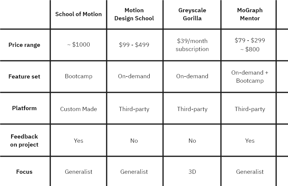
I conducted an in-depth analysis of 25 companies in the online motion design education space. This research highlighted three primary competitors—School of Motion, Motion Design School, and Greyscale Gorilla—and provided critical insights that helped us define MoGraph Mentor’s unique value proposition.
Our differentiator emerged from combining two key strengths: access to industry experts from renowned studios, including Disney Animation Studios, and affordable, feedback-driven training.
Unlike competitors, our offering emphasized direct mentorship from professionals actively working in the field, offering serious motion design students the opportunity to receive actionable feedback tailored to their career goals. This positioning resonated strongly with aspiring designers aiming to upscale their skills and break into top-tier animation studios.
Understand our early adopters and research new audiences to design a better user experience
I conducted interviews with four students and two mentors (course instructors) who were early adopters of the business. These conversations provided the initial insights into the mindsets and behaviors of motion designers seeking education, highlighting several common challenges:
- “I need a portfolio of original work to distinguish myself from other artists.”
- “Getting constructive and meaningful feedback on my project is difficult.”
- “Improving my skills and creating compelling work is daunting and time-consuming.”
- “I don’t know what I should learn and create to help drive my career in the direction I need.”
To validate these findings and deepen my understanding of the target audience, I expanded my research efforts. This included leveraging Google search, public forums like Quora and Reddit, and Facebook Groups to explore various communities within the motion design industry.
Additionally, I implemented a survey in our most downloaded free course to gather input directly from beginners, providing valuable quantitative data to complement the qualitative insights.
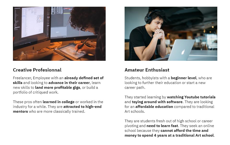
Using the collected data, I developed two detailed personas that represented our target audience, guiding the subsequent design and strategy decisions.
Design Iterations
Technical Stack Choices
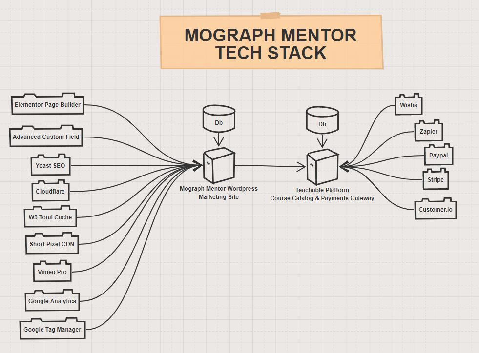
As a smaller player in a competitive market, MoGraph Mentor faced unique challenges. Major competitors already had a significant lead in terms of technology, market share, and brand visibility. To compete effectively, we needed a quick and reliable technical solution that allowed us to focus on what mattered most: delivering high-quality educational content.
Competitor and user research confirmed that the technical infrastructure was less critical to our target audience than the quality of our courses and mentorship. With this in mind, I selected a combination of WordPress for the marketing site and Teachable for our learning management system.
This approach provided the agility to launch quickly while avoiding critical technical debt, ensuring a solid foundation for future growth.
Design Goals
To help me drive the decision making and prioritize design decision, I established design goals:
-
Clarity: The old website suffered from a cluttered and outdated appearance that failed to communicate our mission. A clean, modern design was identified as the first step toward improving usability and supporting business growth.
-
Performance First: For an e-commerce platform, fast loading times are critical to driving conversions.
-
Mobile-first Design: The user experience needed to be seamless across both desktop and mobile platforms. Ensuring accessibility, functionality, and engagement for all audience types was a top priority.
-
Better Navigation: The old website lacked intuitive navigation paths to access on-demand courses—our primary revenue stream. Simplifying access to these courses was essential for the company’s success.
-
Feature Our Mentors: A core part of our mission was fostering human connections through mentorship. Competitor analysis and user research highlighted the importance of prominently showcasing our mentors to differentiate ourselves in the market.
-
Improved Tracking: Data-driven decisions were impossible under the previous setup, as the website lacked analytics capabilities. I designed the new website with robust data collection features to enable tracking and informed decision-making.
-
Iterations: No design is ever truly finished. Iteration was baked into the process, with usability testing and data-driven refinements planned at the end of each sprint. The project followed a three-sprint cycle, each with focused testing and adjustments.
Brand Development
To support future improvements and better communicate our vision, I developed a refreshed brand identity.
Initially, the color palette leaned heavily on lime green and dark tones. However, the lack of contrast in the lime green made it ineffective as a primary color. I introduced a complementary color to create a more balanced and accessible palette, which became the foundation of our visual identity.
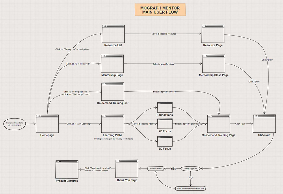
User Flow
Based on user research, I designed a detailed user flow to map out the journey from the homepage to course enrollment. This flow aimed to simplify the process, reducing friction and enhancing the overall user experience.
Wireframes
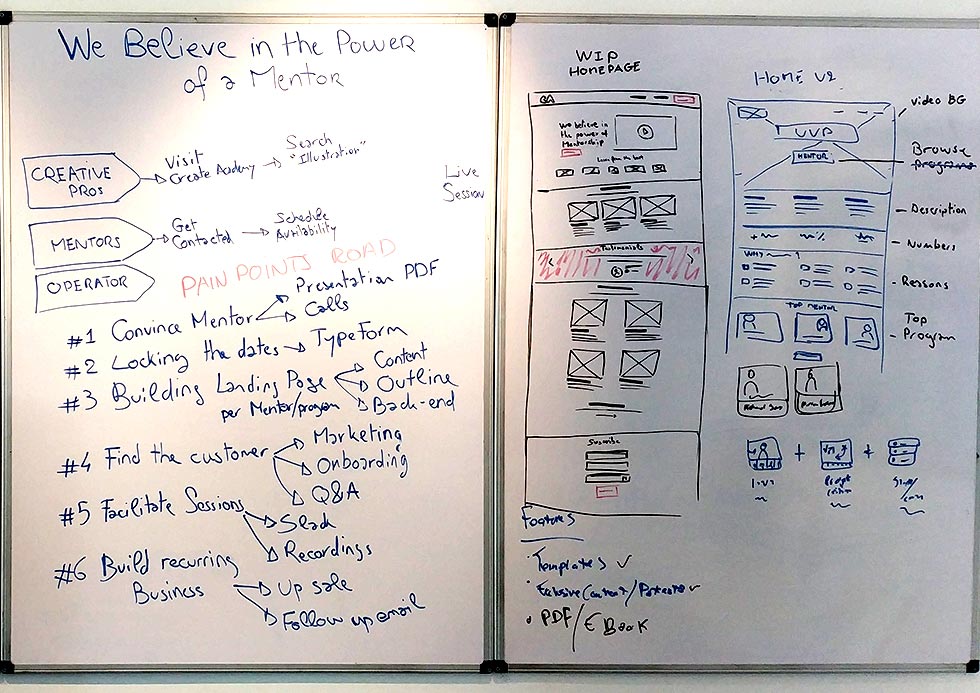
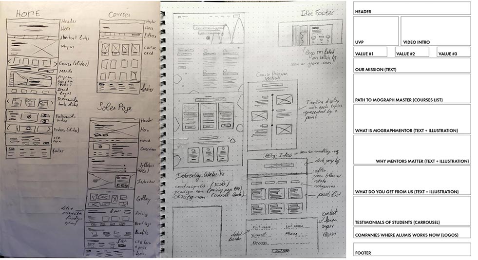
Multiple iterations of wireframes were crucial to pinpointing the optimal navigation and feature set for the new website.
For solo design work, I prefer to sketch wireframes by hand in a notebook, which accelerates the ideation process. When collaborating with a team, I utilize design tools like Figma or InVision for a more interactive and shared workflow.
Testing Design Implementations
Each design iteration was rigorously tested using a combination of tools and techniques:
- Usability Tests: Conducted with course instructors and my business partner to identify pain points and validate design decisions.
- Heatmaps and User Flow Recordings: Leveraged HotJar to track user behavior and interactions.
- A/B Testing: Used custom code to experiment with design variations and optimize key metrics.
These efforts ensured that every aspect of the design met its objectives and delivered meaningful results for both users and the business.
Learnings & Impact
This project was deeply rewarding and reinforced a fundamental truth about design: it’s not just about aesthetics but about problem-solving. Design requires a deep understanding of business needs, market conditions, and user behavior to craft solutions that are both functional and compelling.
The redesigned website, combined with a strategic marketing approach and an informed course development roadmap, delivered significant results:
- 75% increase in monthly revenue
- 171% increase in customer lifetime value
- 147% growth in monthly active users
These achievements fueled the company’s growth, enabling us to expand the team with a Creative Director, Marketing Assistant, and two Video Editors within the following year.
After three years of hard work and dedication, MoGraph Mentor’s journey took an unexpected yet exciting turn. Our efforts attracted the attention of a key competitor, and after recognizing the mutual benefits of collaboration, we made the strategic decision to merge. This marked the culmination of our work but also meant retiring the website I had carefully designed and developed—a platform that had become a cornerstone of our identity. While it was bittersweet to see it decommissioned, it underscored the broader narrative of growth, progress, and adaptation.
Final Results
