Jet Ski Miami - A design exercise

Join me as I walk you through the design process I applied to create a website for a make-believe jet ski rental company in Miami, FL. I’ll take you behind the scenes to reveal the steps that guided me in crafting the website’s design.
Competitor Analysis
To initiate the project, I performed a competitor analysis to gauge how our website would stand against others. This step was particularly enlightening, as designing for an audience I’m not usually acquainted with necessitated an understanding of the competitive landscape to retrieve initial insights.
My search for competitors started with a simple approach: typing the most obvious keywords into Google and seeing what popped up. I also leveraged Google’s auto-complete functionality, which helped identify the most frequently searched queries:
- Jet ski rental Miami
- Jet ski tour Miami
- Water activities Miami
- …
This search led me to discover a range of competitors from large-scale sites like TripAdvisor, Groupon, and Yelp to smaller, niche websites.
I sifted through platforms like TripAdvisor and Yelp for customer reviews. The insights from these reviews were crucial—they were my initial stepping stones to creating user personas.
The websites of smaller local businesses were equally informative. They provided a clear view of specific features we might overlook in the ideation phase and presented a current snapshot of what was on offer to customers —- key information for building a lean canvas.
User research
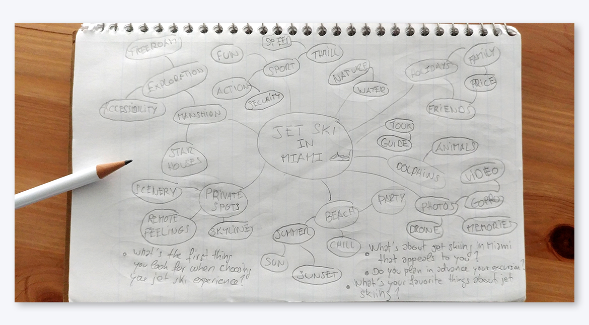
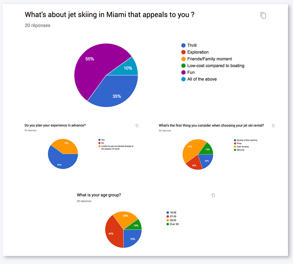
My research began with developing a topic map filled with words and ideas that come to mind when thinking about jet skiing in Miami. This map laid the groundwork for a user survey that I distributed online to a pool of potential users. The survey responses highlighted recurring themes, giving me a clearer picture of potential user pain points, expectations, and preferences for the website’s content.
I also used the survey questions as a jumping-off point for in-person qualitative interviews.
Qualitative interviews are invaluable for a deeper understanding of users’ needs and thought processes. They require more than just the act of asking questions—they demand active listening and empathy, often revealing insights that a straightforward survey might not capture.
Affinity mapping
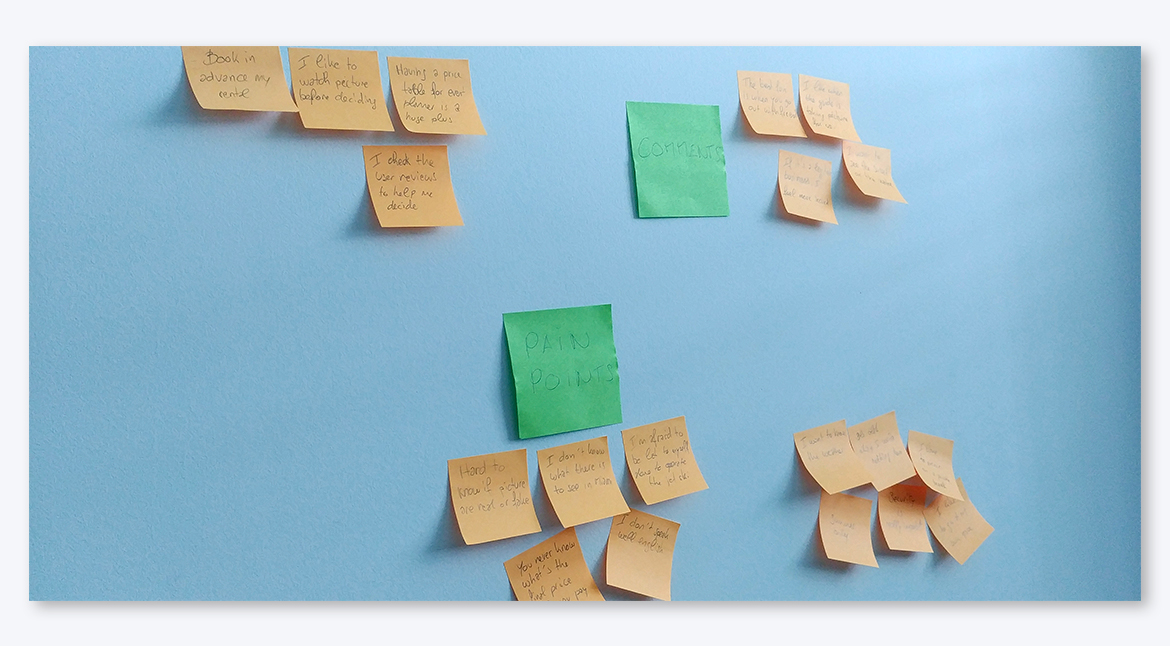
I compilled the survey and interview responses and began affinity mapping to detect common patterns. Whether working alone or in a group, affinity mapping is a potent tool to categorize observations and catalyze ideas throughout the research and brainstorming phases.
This process affirmed my early assumptions, identified shared user experiences, and guided the subsequent stages of my design process.
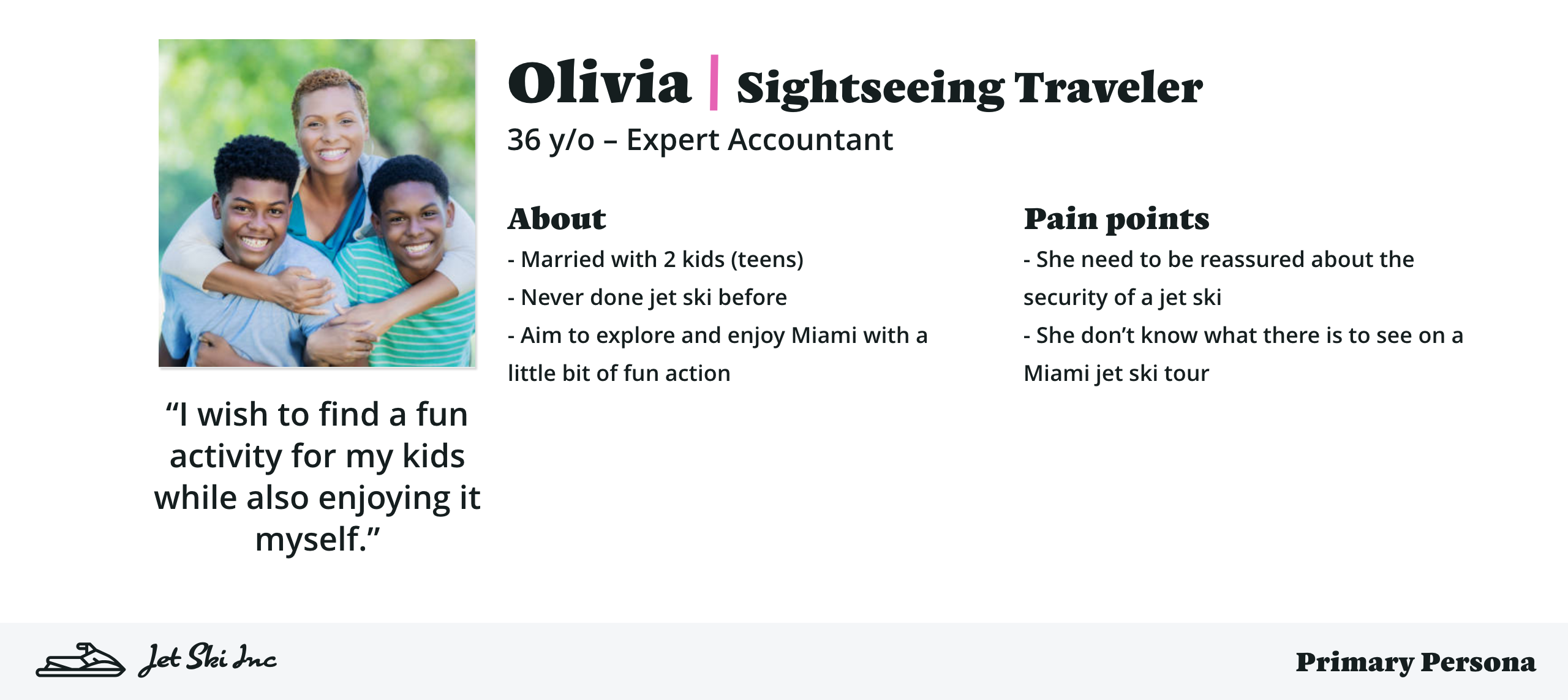
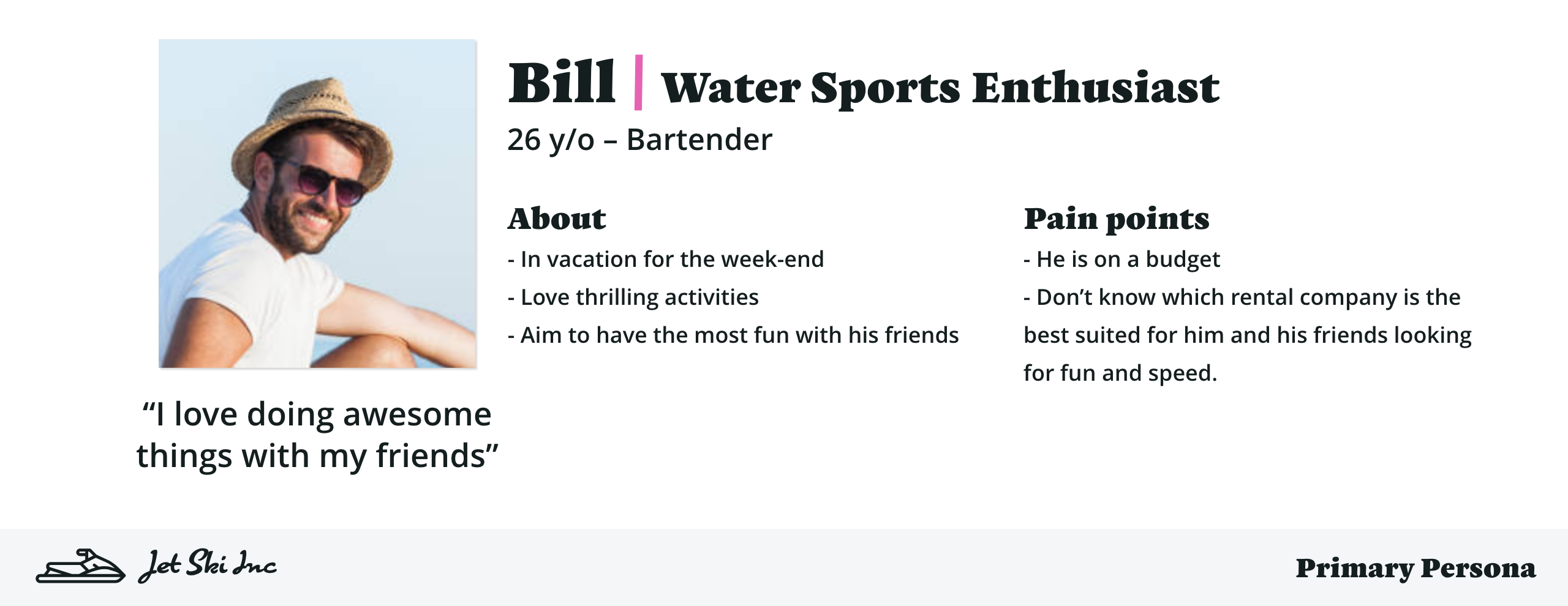
Personas
From the competitive analysis and user research, I crafted personas that represent our target audience in both demographics and psychographics.
I identified two primary personas, ensuring that the website would meet each of their specific requirements. I also considered secondary personas—such as an Event Planner organizing a corporate event—who present additional, albeit less critical, needs when prioritizing time and resources for website feature development. The personas I created were the Sightseeing Traveler and the Water Sports Enthusiast.
Creating these personas was like drawing from a well of user archetypes, which helped me develop empathy and keep a focused direction during the ideation, design, and iteration phases. It was a constant reminder that I was designing for a specific user, not for myself.
User stories
With the personas and competitive analysis in hand, I began to shape the website’s features through user stories. These stories are pivotal for charting a course for the features to implement, ensuring all needs of the personas are met. Drawing from Agile methodologies, user stories shift the focus from ‘how’ to ‘what’ needs to be accomplished, giving me and my team the creative space to innovate solutions for user requirements.
- As a Sightseeing traveler, I want to know what sights I’ll see on a jet ski tour to set my expectations accordingly
- As a Sightseeing traveler, I want to easily find safety information and tour details to ensure the legitimacy of the offer
-
…
- As a Water Sports Enthusiast, I desire to read reviews from fellow enthusiasts to confirm that this jet ski rental meets my needs
- As a Water Sports Enthusiast, I need clear pricing options to share with friends for a quick decision-making process
- …
Sitemap and User Flow
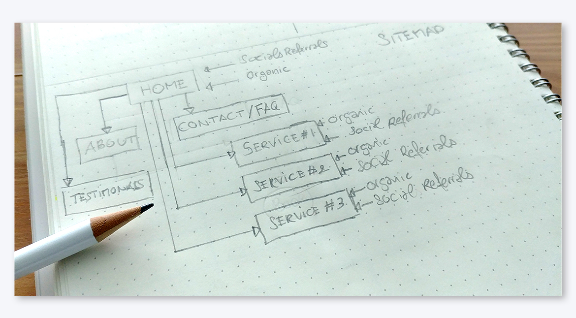
The creation of a sitemap and user flow came next. This helped me visualize the structure and navigational pathway of the website. It’s a crucial step in ensuring the user’s journey is intuitive and meets the expectations set by our user stories.
Wireframe (low-fidelity mockup)
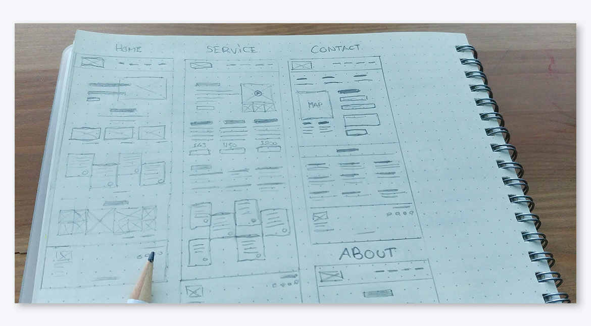
With a solid understanding of the main features and user flow, I rolled up my sleeves and dived into designing the website’s first wireframes. This is where the ideas start taking a visual shape.
In a team setting, I find it beneficial to employ the Design Studio method. It involves each team member sketching rapid prototypes independently, followed by collective reviews where we critique, collaborate, and converge on the best ideas to develop further. This process fosters a dynamic of quick iteration, critique, and feedback.
When working solo, I don’t hesitate to share my sketches with the community on Slack or with friends to gather feedback. Collaborative input is often invaluable for innovation and refinement.
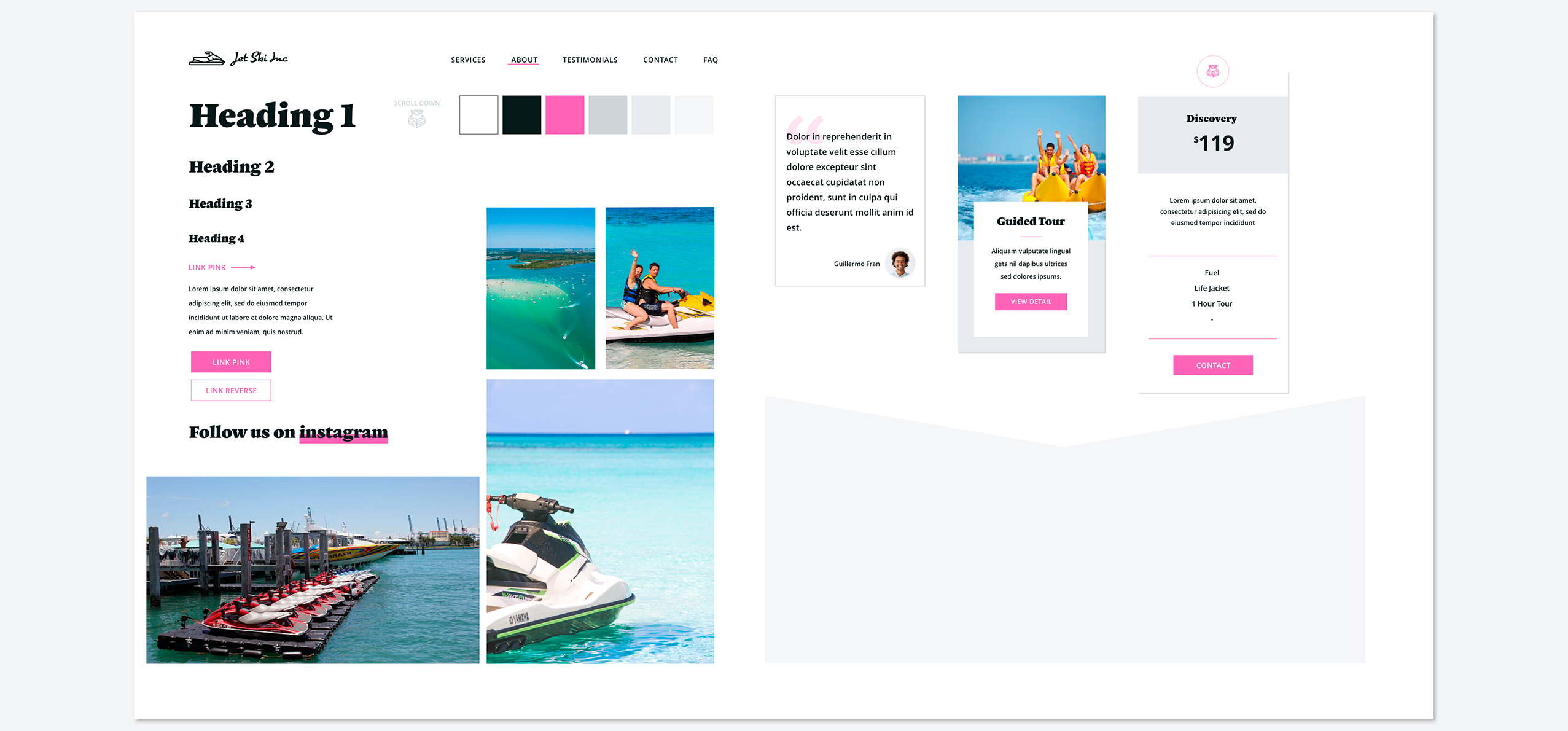
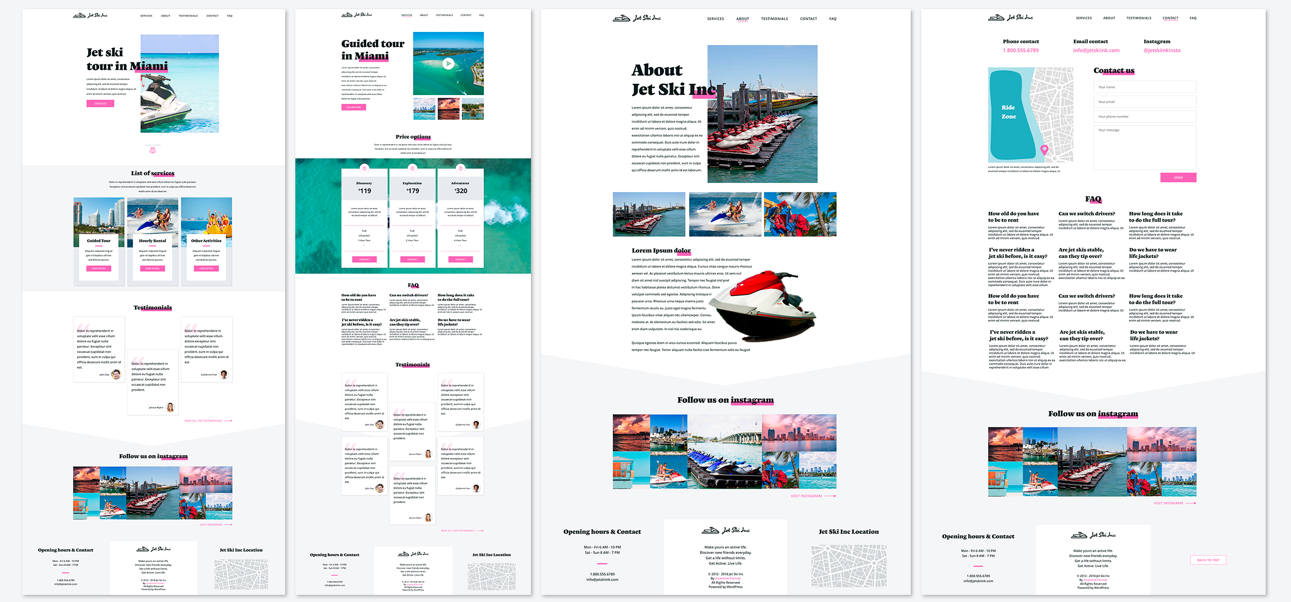
Designs (high-fidelity mockup)
Armed with validated wireframes, I embark on creating high-fidelity mockups. The first step is to curate a mood board that showcases the selected typography, color palette, and imagery.
This mood board sparks creativity and sets the visual tone I aim to achieve with the design. It transitions the wireframes into polished designs ready for stakeholder validation. While these high-fidelity mockups build upon the wireframes, they’re not constrained by them; fresh ideas can emerge as design elements come together.