Booking.com - A/B test idea
In October 2016, I was approached by Booking.com’s recruiter about a position of UX/Product Designer. One of my test during the hiring process was to design a simple A/B test that can be setup on the desktop version of the website.
When we look at Booking.com website, it looks messy and complex ! But somehow, we manage to found what we are looking for, right ? This is the result of an accumulation of several years of tests and improvements done through A/B testings. Each UI elements have a real purpose.
Your can learn more about Booking’s A/B test philosophy in this video :
In order to deliver an actionnable result in accordance with the development constraints of the platform and the philosophy of A/B testing at Booking.com, I focused on a small change with specific KPI’s.
Here is my design process…
Introduction
In order to understand all services of Booking.com, I firt spent several hours reviewing the different versions of the website (Desktop, Tablet, Mobile, Native App).
Thereby I was able to list all features that the website provides. I’m a big user of booking.com. I travelled a lot around the world and I was always relating to Booking.com to find my accomodations. Even that, I discovered that I was only using a small portion of the website as I already have my own user path.
User research
I conducted some exploratory interviews of few minutes with regular customers of booking.com to know how they were using the website.
- A couple seeking where to go on honeymoon. -> They look for a “romantic” destination
- Two friends who want to organize a weekend to celebrate their reunion. -> They look for a “Nightlife” destination
- A man who wants to take a retreat for a few days in a remote place. -> He looks for a “Quiet and Nature” destination
Results show that they use Booking.com only when they already know their destinations.
They use it as a simple price comparator.
They didn’t know Booking.com is also able to guide them to find future destinations.
Scenario
To help my reasoning, I like to create small use case scenario.
It’s decided, I'm taking a vacation !
I’m visiting my favorite booking site to choose where to go, Booking.com.
I'm on the home page.
I don’t know yet where I want to go. All I know is that I need a vacation.
The problem is that booking.com doesn’t guide me enough in my destination search.
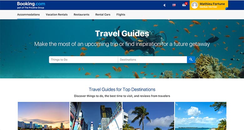
The feature - thematic destinations
By reviewing with attendance the website, I saw Booking.com can suggest destinations based on specific themes (Relaxation, Hiking, Romance, Shopping, …)
I tested this feature in different languages and with different IPs. Apparently, these blocks are showing randomly and suggest only 3 themes: relaxation, tranquility, beach (A/B test running?)
A user looking for inspiration, without being sensitive to these 3 themes or that couldn’t see this block in his version, can’t know there is a solution to be adviced in his search.
This feature could match the need of Booking users looking for advices and inspiration.
By putting forward this information, this would follow a user from the emergence of his vacation need, until the end of his hotel booking.
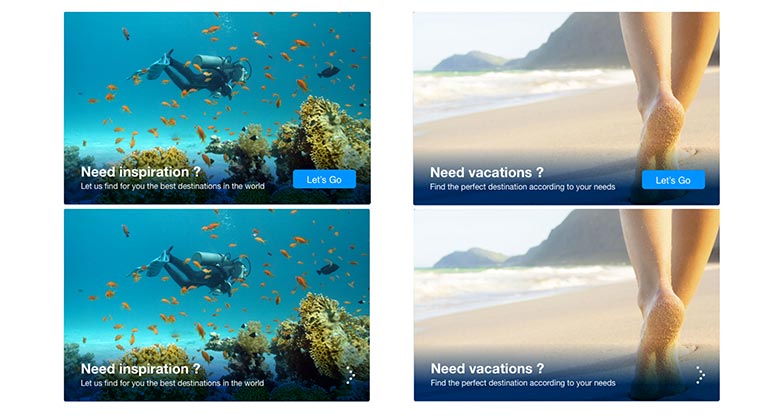
The A/B test
Improve and put ahead this block on the homepage in order to reach users looking for inspiration for their next trip.
The first job would be to change the baseline in order to involve more users with a general sentence.
Then I’ll add a call to action like “Let’s Go” in order to attract users attention. If it’s might be too much, I can just set an arrow to indicate an action after this block.
The link of the block will redirect to this
To keep the seasonality, it would be interesting to have a random background images that match with current seasonal themes (ex: tropics or moutains in winter, for example).
Baseline examples :
Need a vacation? Find the perfect destination according to your needs
Need inspiration? Let us find for you the best destinations in the world
KPI’s
For this A/B test, I’ll look for 3 Kpi’s which are :
-
Increase the click rate on the advice block
-
Reduce the home page Bounce Rate
-
Conversion when users enter search since the page
Propositions
Here on this marvelapp page, you’ll find the UI of my A/B test.