Card sorting - Improve information architecture
Card sorting is a method for designing user-centric information architecture. In this article, I will attempt to describe its use and its benefits when designing a site as well as showing a concrete example.
What is information architecture?
Information architecture (IA) is a key component of a website success with its users. It makes content easy to find when a website is complex. It refers to the website information structure. Usually, we use a navigation component (sitemaps, menu, breadcrumb, filters) to navigate inside a website. This navigation is used by the user, and therefore if you want to improve it, card sorting is here to help :) .
What is Card sorting?
This is an efficient and easy-to-set method of asking users to sort, aggregate information individually on a card and then label each group. It allows designer to involve the user in the creation process by sorting, categorizing and naming the structure of the information. Using feedback of users to build one of the keystones of any website makes their experience more intuitive and enjoyable.

How to create a card sorting?
The good news is that this method is cheap, fast and useful. To create a card sorting workshop, you just have to write on pieces of paper the elements you want to sort by the user.
This may be :
- Sort products into an E-commerce website
- Organize Q-A section
- Define category labels
- Sorting pages in a menu
- Create product filters name
Then we ask users to group and sort the cards according to their mental model and to give a name to each created heap.
There are three possible approaches of doing it. Open sort, closed sort, and inverted sort.
- Open: Users are free to create and name categories and to group cards into them.
- Closed: Users have pre-defined categories and must group the cards into them.
- Inverted: The architecture is already created, the user is asked to find a precise information and we observe how he managed to do it. It could be a way to validate the first two approaches.
Most of the time, the card sorting is done individually, the user is the only decision-maker. The facilitator can ask questions at the end of the sorting during a debriefing in order to understand the logic behind the choices the user took. It’s also possible to do it in group. This method allows several users to discuss on a sorting to help the facilitator better understand how the cards are sorted.
The number of cards required can vary from 30 to 100. You should keep in mind that more cards means more time to sort and more complexity for the user who will have difficulty to remember all cards.
Card sorting workshop @1001pharmacies

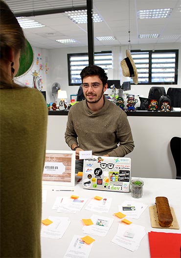
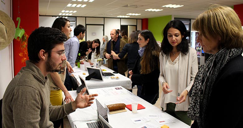
During a start-up assembly event at 1001pharmacies.com, I hosted a card sorting workshop by taking advantage of this event to meet with users and get their opinion on the product category architecture within our E-commerce website.
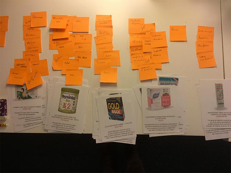
I used the top seller products for this sorting. To simplify the process, several decks were created in order to allow several users to do the workshop at the same time. Small tips, for a paper version, don’t hesitate to make nice looking plastified cards. This makes the manipulation more fun for the participants. Also asked the participants to think aloud and don’t hesitate to ask questions about what they are doing to better interpret their thinking.
This workshop led to interesting exchanges of opinions among participants. This actually help to understand the diversity of users’s logic when they navigate throug an unorganized structure.

Processing results

Card sorting lends itself very well to quantitative analyzes, it gives a synthetic view of the sorts made by the users.
For the treatment of these results, I performed what is called a classification by category or histogram.
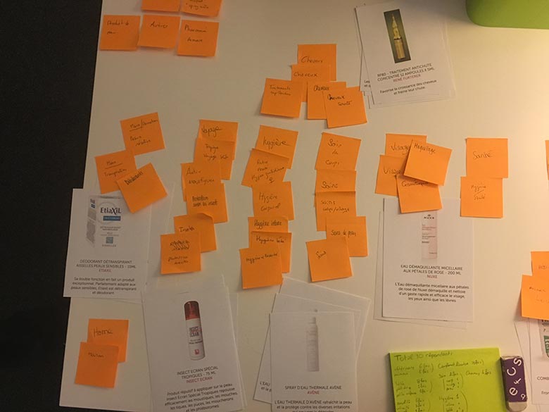
It is a quantitative method of associating the categories created by the participants. For example, on the this sorting, a majority of participants classified the same products under a “Baby” category, we can then create the hypothesis that the users of the site will be first looking for this type of product under the category “Baby” . However, prior work must be done to group the categories together with a name having the same meaning and to choose a generic name, for example “maternity” and “baby”.
These results helped the catalog team to better design categories of the new version of the E-commerce website and to avoid internal debates or the influence of HIPPO.
Final Thoughts
Card sorting is a must have technique when designing any website IA because it’s cheap, fast and reliable. This is a good way to get acquainted with user centric design, information architecture and it’s a fun workshop for participants. But, stay vigilant, it’s not the solution to all the problems of a website. Improving the IA only resolve some of them. However, this technique coupled with other user-centric design methods makes it a very good tool to work with when starting a new project or when remaking an existing site.
If you liked this article and you also want to use this method, do not hesitate to contact me to work with you on your project and make it more user friendly