
Two sprints, zero engineers: An AI-accelerated design process
My squad was tasked with defining the northstar vision for the Digital Vault, a secure platform that gives retail jewelry customers a way to catalog and insure their pieces while maintaining their connection to their trusted jeweler. We would then present that vision to senior executives as input into a larger strategic plan. The constraint: two sprints, no engineering bandwidth, and a need for something real enough to put in front of actual users.
I used this as a chance to see how far frontend and product experience, combined with a new generation of AI tools, could take a single designer. The result was a fully interactive, mobile-first React prototype built without engineering involvement that shifted executive conversations from features to strategy.
Context
Waiting for the right moment
I’ve followed AI closely since GPT-4’s release in March 2023, and became a daily user of these tools by late 2023. In 2024 I put it to work in production: at Carbon Direct, I designed an AI-powered Scope 3 workflow that paired large language models with a human-in-the-loop correction tool that fed every analyst fix back into an ML model.
Yet I deliberately kept these tools out of my own design and prototyping workflow. That changed in late 2025, when I tested Build by Reforge, a beta-phase AI prototyping tool, on an exploration of how to modernize customer support tools for managing policy cancellation requests. I saw the potential immediately. I also saw the problem: I was spending more time tweaking prompts than making actual design progress. The tools weren’t mature enough yet to be a genuine force multiplier, and on projects with pressing deadlines, that time investment wasn’t worth it.
So I kept waiting. Not for the tools to become perfect, but for a moment where experimenting would also mean delivering something genuinely valuable.
That moment arrived in March 2026. My squad was tasked with defining the northstar vision for the Digital Vault and presenting it to senior executives as input into a larger strategic plan. Two sprints. No engineering bandwidth. A need for something real enough to put in front of actual users.
I had frontend development and product management experience that most product designers on my team didn’t. I wanted to see how far that background, combined with a new generation of AI tools, could take me. This case study documents what I built, how I built it, and what I learned.
Sidenote
How the four weeks actually worked
Before getting into the phases: this was not a clean sequential process. Each week involved some combination of research, discovery, and design exploration. The first two weeks were heavier on synthesis and direction-setting. The last two shifted toward iterating on the prototype. Each version got bigger, and each cycle fed the next.
What follows is organized by type of work, not by strict chronology.
Phase 1
Using Claude to synthesize research and shape product direction
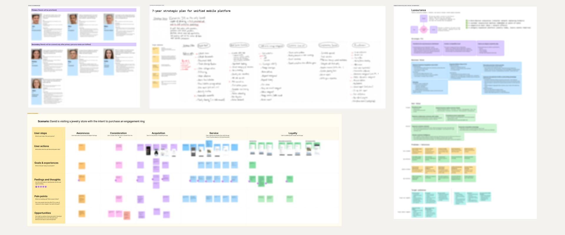
Competitive analysis, business plans, and user research had already been conducted across the organization for intersecting projects. The problem was that none of it had been synthesized into a cohesive vision anyone could act on.
I fed Claude everything: the existing research, plus what I dug up myself from forums, social media, and industry publications. Then I used it as a sounding board, testing emerging ideas against all that context. The goal was to move faster through the problem space without losing the human judgment that makes research meaningful.
The output: structured insight summaries, a clearer picture of the problem, and a faster path to a PRD and requirements document to carry into the design phase.
I also connected with my Product Manager and Tech Lead early to share findings and pressure-test initial directions. They had been exploring the problem space independently, and the overlap in our conclusions gave the team a stronger shared foundation to build from.
The synthesis work in Phase 1 served a second purpose that only became clear later. Here I developed insights about the target audience, their needs, and the design context. Those insights became the direct basis for the design principles I later embedded into Claude Code’s behavior. The research ended up shaping the quality of the prototype output, not just the product direction.
AI tools should not be granted any decision-making power. They are a remarkably capable autocomplete engine.
Phase 2
Sketching before prompting: why the whiteboard still comes first
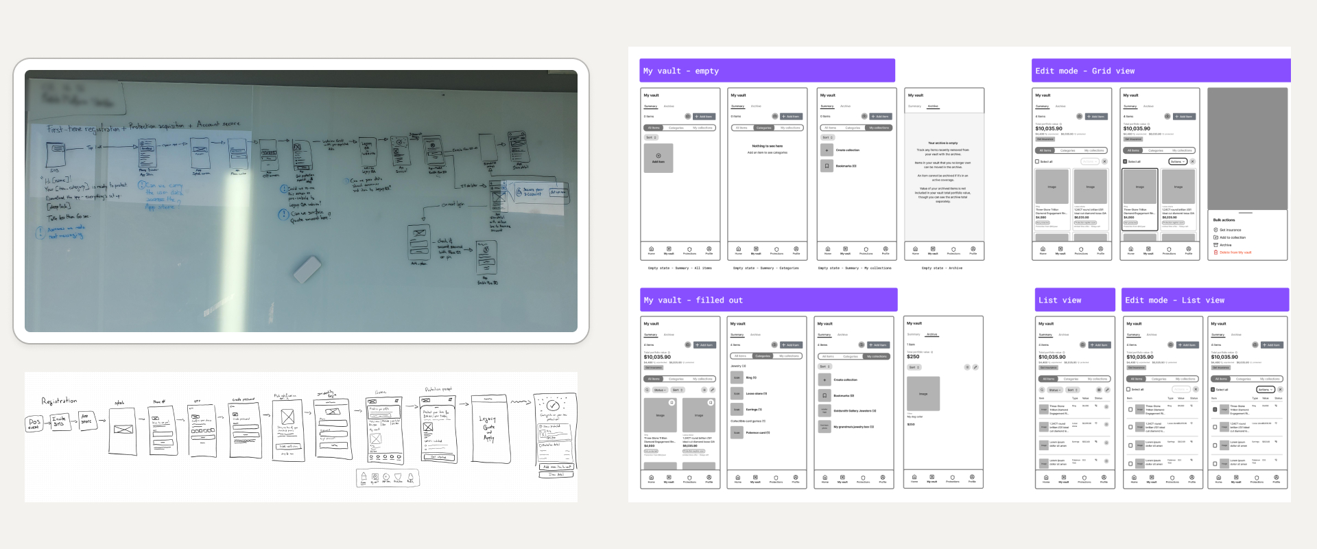
Before any code was generated, I sketched.
Using a combination of physical whiteboard, Microsoft Surface digital whiteboard, and Figma wireframes, I worked through ideas before touching any AI tool. This step is non-negotiable for me. The whiteboard is where design judgment gets applied: competitive analysis, research synthesis, and experience converging into rough layouts and flow concepts.
Once an idea was worth pursuing, I’d capture it: a phone photo of a whiteboard sketch, a screenshot of the digital canvas, a quick Figma wireframe recreation. These artifacts became direct inputs to the next phase.
Phase 3
Connecting the pipeline: Claude Code, HeroUI, and the design system decision
Several months before this project, a colleague and I had conducted extensive research into what design system approach to recommend for our organization. The options were to build from scratch, fork an open-source foundation, or license a solution. We chose HeroUI v3, an open-source system built on React and Tailwind CSS and designed to be compatible with AI code generation tools. We then collaborated with other designers to establish a custom theme on top of it. By the time this project started, HeroUI was being used across the design team on multiple projects.
To go beyond the design system, I paired Claude Code with two additional inputs:
- A CLAUDE.md file containing context about the business and the target audience.
- A design principles skill listing specific instructions I had developed based on my understanding of the audience’s needs and pain points.
---
name: jm-design-principles
description: >-
  UI-generation guardrails for the Digital Vault prototype. These govern
  HOW the UI is built, not WHAT to design — design decisions arrive via the
  wireframes attached to each prompt. Apply to every screen and component.
---

# Digital Vault — UI generation principles

These are implementation guardrails, not design direction. Render the
wireframes faithfully while obeying the rules below.

1. **Build from the design system, never from scratch.** Compose screens
   exclusively from HeroUI v3 components and theme tokens. Don't hand-roll
   components that already exist in the library, invent spacing or color
   values, or write inline styles. If a needed pattern isn't in the system,
   use the closest existing component and flag the gap rather than improvise.

2. **Keep the UI visually neutral.** This prototype is for unbiased user
   testing — nothing should steer a tester's reaction. No emoji, no
   decorative gradients, no persuasive or marketing treatments, no gratuitous
   color or emphasis. Use the default theme weight everywhere unless a
   wireframe specifies otherwise.

3. **Mobile-first, always.** Assume a phone viewport. Single-column layouts,
   thumb-reachable primary actions, touch-sized targets. Add larger-breakpoint
   behavior only when explicitly asked.

4. **Minimize friction and cognitive load.** One primary action per screen.
   Prefer progressive disclosure over dense screens. Keep required input to a
   minimum and make everything else optional and deferrable. Don't surface a
   control until the user needs it.

5. **Help the user; don't sell insurance.** Insurance is one of several
   services, not the product. Frame everything around the user's own goals —
   cataloging, organizing, and protecting their pieces. No upsell banners, no
   insurance CTAs competing with the primary task, no sales-funnel copy.

6. **Establish IA before filling the page.** For a new screen, lay out the
   information architecture and navigation first — regions, headers, and empty
   containers — and confirm the skeleton before populating it with content.
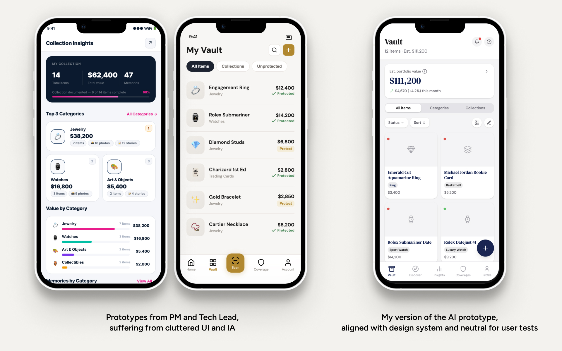
Before these inputs were connected, Claude Code’s output showed the predictable biases of raw AI generation: inconsistent design patterns, heavy emoji use, an inexplicable affinity for gold tones. With HeroUI v3 connected via MCP and both context files in place, prototypes came out visually consistent, neutrally styled, and structurally sound.
I wasn’t the only one experimenting. My Product Manager and Tech Lead were building AI prototypes in parallel, prompting feature ideas directly, with no design system connection and no deliberate IA work. The side-by-side became a useful natural experiment. Their prototypes carried all the raw-AI tells I had just engineered away, plus a messy information architecture. Mine, anchored in the company’s brand identity with deliberately crafted navigation and IA, had the coherence and credibility to put in front of executives.
Phase 4
Iterating in code: how frontend skills changed the workflow
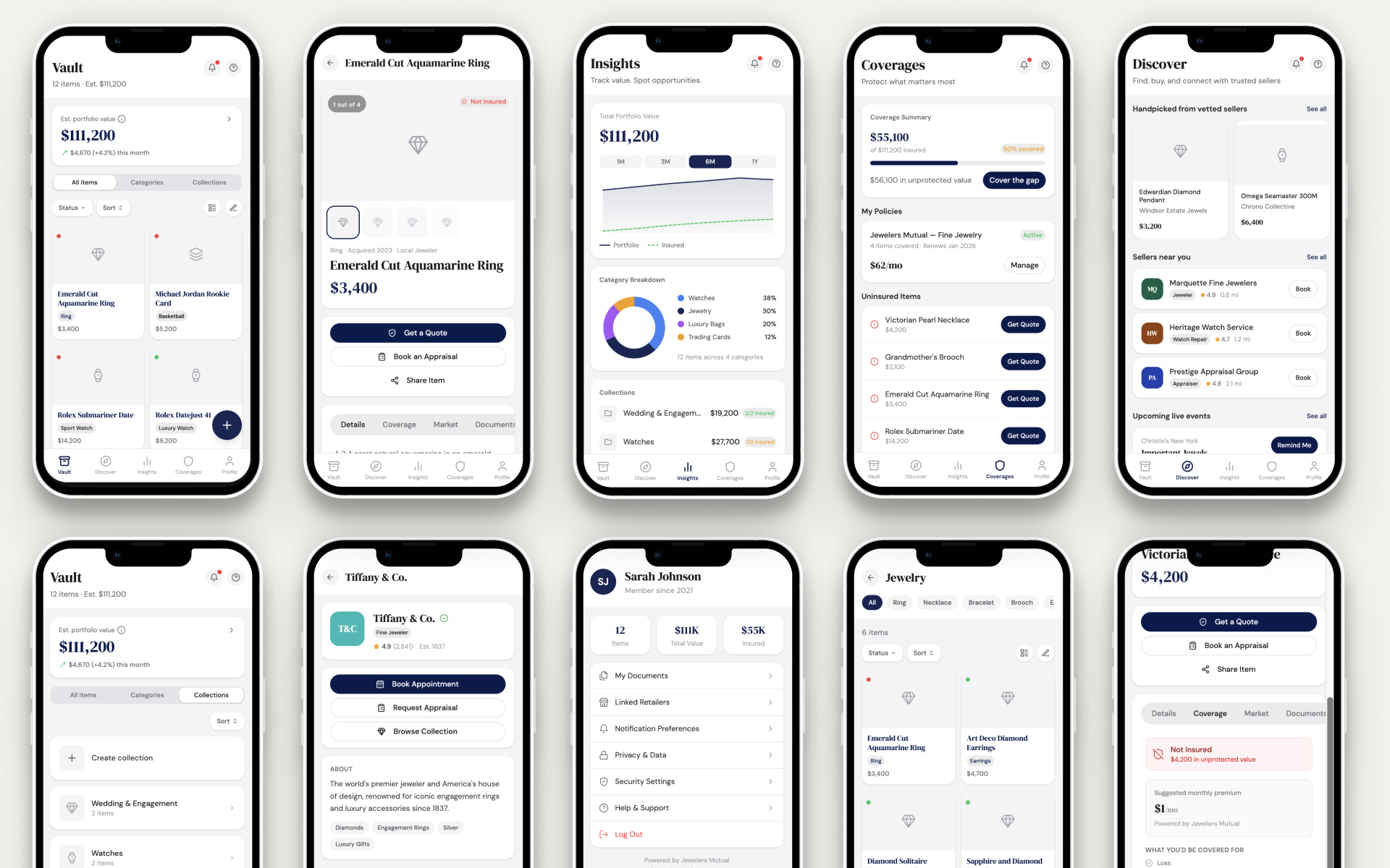
Rather than attempting to generate an entire prototype in one prompt, I worked feature by feature, spec-first. Each feature began as a small PRD I authored in Claude chat: the screen’s information architecture, the sections it contained, and the states each could take (an item, for instance, could be insured, not yet insured, or pending coverage).
Authoring the PRD was itself a loop. Before calling the document done, I had Claude review it, surface gaps, and ask me clarifying questions until nothing about the feature was ambiguous. At the time this was an improvised discipline; Matt Pocock has since formalized the same idea as his grill-with-docs skill, which I now use on every project.
Then I cleared everything. Each feature started in a fresh Claude Code session. The only thing I carried over was the finished PRD, plus the standing inputs from Phase 3: the CLAUDE.md file, the design-principles skill, and HeroUI via MCP. Since the spec was already settled, the session could go straight to building. The first pass was structure only: empty regions, navigation, headers, no real content. Then I filled in the screen one component at a time. Working in small steps like this, with a clean context for each feature, kept every output small enough to actually review. It also kept token usage down.
This has since become a recognized pattern in agentic workflows: human-in-the-loop, multi-phase plans, where a large task is split into small scoped runs and the context is cleared between them. The formalized version externalizes the plan into a file the agent re-reads at every phase: which features exist, in what order, what’s already done. My version had no such file. The cross-feature plan lived in my head: I was the plan file. That cost nothing on a solo project, and it kept the product’s overall coherence where it belonged: with the human, not the model.
After each generation cycle, I made lightweight adjustments directly in VS Code: spacing, typography, layout composition. The alternatives were worse: round-tripping the design back into Figma, or re-prompting the AI until the output drifted close enough, burning tokens on changes a human can make in seconds. Being a T-shaped designer removed that bottleneck entirely.
For two straight weeks, I barely opened Figma except to reference existing sketches and wireframes. Of everything this process changed about how I work, that felt like the most significant shift.
One deliberate choice shaped this phase: I kept the generated code clean enough to be a viable basis for an engineering handoff, even though production-readiness wasn’t the goal. The gap between test-ready and ship-ready code is real, but I didn’t want that gap to be a conversation-ender if an opportunity arose to take the prototype further.
The generated code had occasional inline styles (the guardrail from my design-principles skill that Claude Code obeyed least reliably) and minor structural inconsistencies, but it was more than sufficient for the stated purpose.
Outcomes
What shipped: a prototype and a different executive conversation
The result was a fully interactive, mobile-first React prototype representing the northstar vision for the product, built without engineering involvement across four weeks. I managed the code review, environment setup, and technical decisions myself.
Getting to that fidelity that fast was the whole point for a project meant to align senior executives and stress-test product direction before any build investment.
The prototype was presented to a group of 12 senior executives and stakeholders. The shift in conversation quality was immediate. In previous reviews, discussion had circled around features (outputs) without reaching the harder questions of business model and product strategy.
In this session, one business stakeholder stopped mid-presentation and began suggesting concrete ways to expand features and create synergies with partner jewelers. The conversation moved from abstract speculation about what the product should do to practical thinking about how to monetize it. Executives who typically struggle to engage with abstract product direction had something real to react to, and that changed what they were able to contribute.
It also eased a familiar problem: when there’s nothing concrete to react to, opinions fill the gap. A tangible, interactive artifact gave the discussion an anchor.
Sidenote
A note on what "fast" actually costs
AI tools make it dangerously easy to rush toward a solution. The prototype-generation phase feels productive, even exciting, and that feeling makes it easy for designers and stakeholders to skip the harder work of problem definition. I’ve watched stakeholders pick up these tools and immediately start generating screens, bypassing research entirely. The output looks convincing. The thinking behind it often isn’t.
I was able to move quickly because I had been embedded in the problem space for several months. I could draw on existing research, prior discovery work, and accumulated context that made the design phase feel fast without actually being rushed. The AI accelerated execution. The research made that execution credible.
The token cost of this approach is real, too. Agentic AI workflows can consume significant compute, because the model makes many sequential decisions. Teams should be honest about whether the cost is worth it before making this a standard process.
Where this workflow goes next
For a next run, I’d apply the same pipeline to smaller-scope iterations aimed at building a production-ready MVP to test product/market fit for new ideas. The workflow suits early-stage validation where speed of learning matters more than code quality.
Since this project, generative AI and prototyping tools have become a permanent part of my daily workflow, and they have made my design process much faster. I reach for them across research, exploration, and building. That includes this very portfolio, which I’m actively refactoring with the same AI-assisted approach. What started as a deliberate experiment under constraint is now simply how I work.
Each phase required deliberate human decisions: the research, the sketching, the prompting, the tweaking. What stayed human was the thinking, the judgment, and the framing of the right problem. PMs, designers, and developers who forget this aren’t using AI as a tool. They’re outsourcing their craft.
The tooling was the accelerant. Human judgment was the engine.