UX Workshops FLUPA @ 1001pharmacies
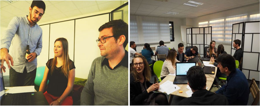
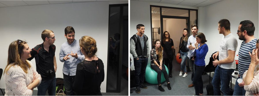
The 7th of April 2016, the montly Montpellier FLUPA’s MeetUp taked place in 1001pharmacies.com offices.
UX FLUPA’s MeetUp are an occasion for UX designer and other to met and discuss about UX related topics around a good beer and nice atmosphere.
It follow a proposition I sent to FLUPA managers. The idea was to plan a users testings workshop where everybody can bring and present his website/product in order to be tested by MeetUp’s participants.
Around 50 people were present. Finnaly, only 1001pharmacies.com’s website were tested because no one have an another website to show.
This MeetUp was co-organized with Amanda Martinez (Wonderful Digital), Chloé Pellen (Tabmo Engineering) and myself.
I was in charge of planning, logistic and animation of some mini workshops.
Progress
I was inspired and help by methods from Carine Lallemand’s book “Méthode de design UX” to plan these workshops.
3 test were picked to allow participants experiment the first MVP (minimum viable product) iteration of the new 1001pharmacies.com funnel.
These tests were held by 3 people with one computer. An interviewer, an interviewee and an observer.
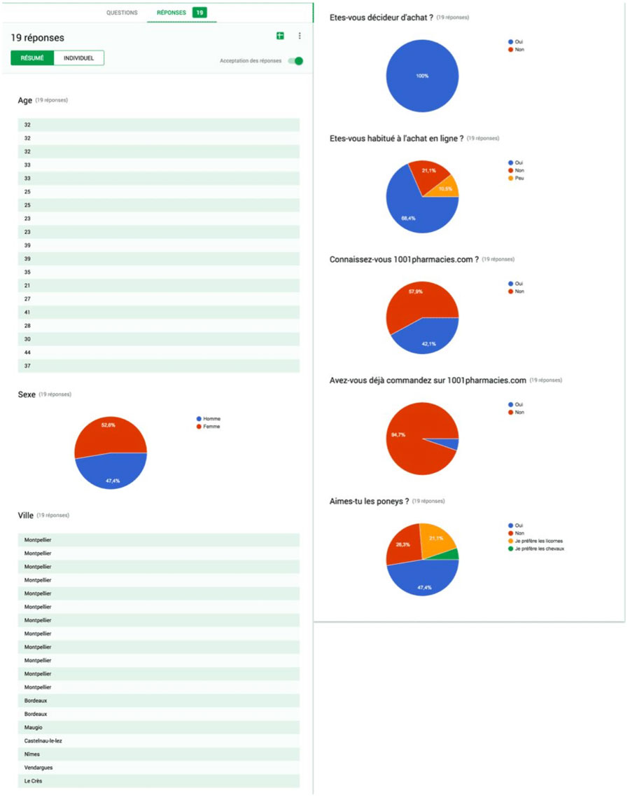
The first test consisted in better know people who were tested with a mini exploratory survey.
In a will to emphasize on user tests (the time of the workshop is limited), questions have been minimized. They were:
- Age, Sex, City ?
- Are you a buying decision maker ?
- Are you used to shop online ?
- Do you know 1001pharmacies.com ?
- If yes, have you ever ordered on 1001pharmacies.com ?
- Do you love ponies ? (just kidding)
The second test was what we call the “5 seconds test”. It allow to collect first impressions of a person on a given element. This test was performed on the home page of the site in order to know the feelings of users at first glance.
Finally, the third test concerned the ordering process. Interviewees were invited to perform taks guiding them through the buying process.
Every year, summer comes, I want to order my beach panoply (sun cream, a refreshing spray and moisturizer).
After these tasks done, respondents were asked to complete an “AttrakDiff”, a survey to assess the pragmatic and hedonic qualities of a system.
Test’s results
After this workshop, I aggregated and analyzed test’s datas.
The purpose of this workshop was primarily to provide an opportunity for participants to become familiar with the methods of user testing.
For 1001pharmacies, feedbacks were very positive, and it allow us to confirmed our assumptions about funnel’s user experience.
Test #1
Integration of exploratory surveys feedback’s into a google form to better visualize data.
Test #2
Feedbacks of the 5 seconds test were grouped into keywords.
These keywords allowed us to identify feelings of users discovering website’s home page.
Consequently, elements that may hinder understanding of the user has been modified thanks to these feedbacks.
Test #3
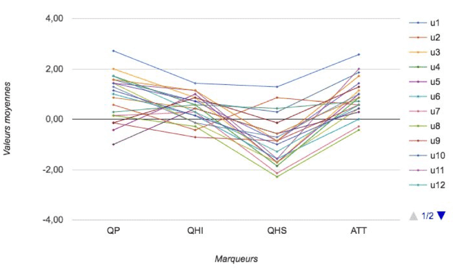
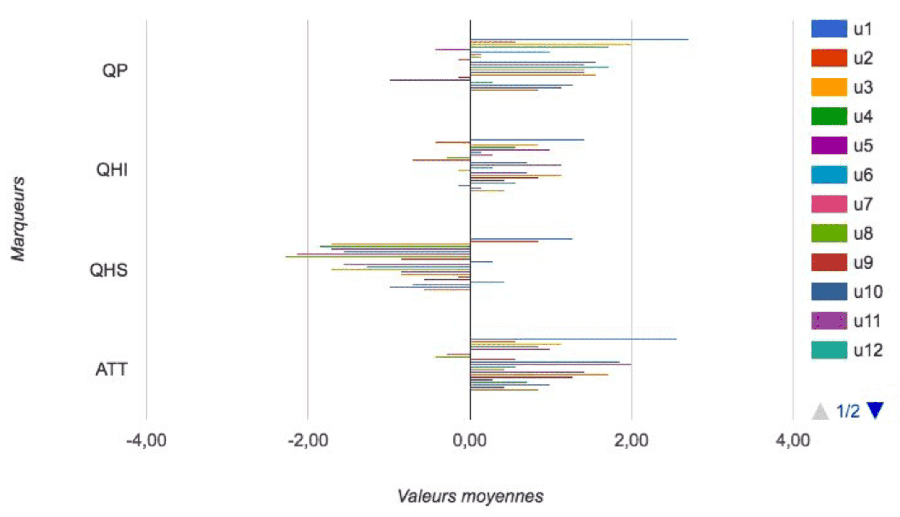
Once AttrakDiff were aggregated, I created a graphical representation of results.
Each graphs represent the average score of the tested system’s 4 groups of qualities by user point of view :
- PQ : Pragmatic Quality
- HQI : Hedonic Quality of Identification
- HQS : Hedonic Quality of Stimulation
- ATT : Overall Attractiveness
More a value of a quality is positive, more it’s present in the tested system. Conversely for negative values.
The objective is therefore to juggle with these qualities in order to get the result we aimed for the system.
For example: On a funnel, the pragmatic aspect (serious task) is relatively more important than the hedonic aspect (fun task).
I invite you to read the article by Carine Lallemand for further explanation of this method (FR).
We can see from the charts below that values of attractiveness and pragmatism are relatively positive while hedonism is less present.
We can consider that’s mean items in the pages are simple to understand, clear and accessible.
AttrakDiff in lines
AttrakDiff in bars
Results portofolio
Conclusion
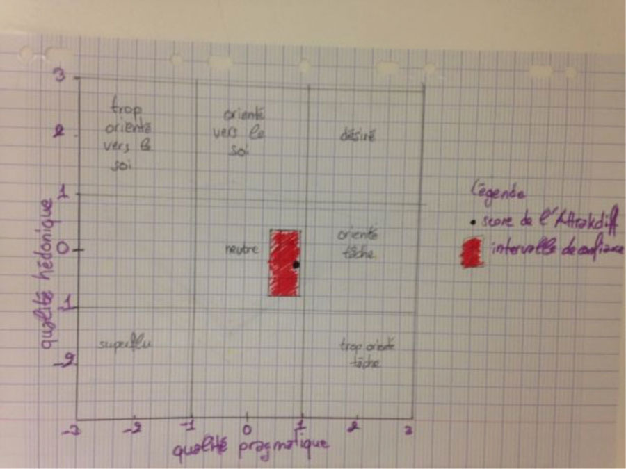
The user experience of the funnel shows a neutral character slightly oriented tasks.
This is positive because the objective of a funnel is to guide the user in the final purchase process, it’s a moment of concentration and seriousness which should not be distracted by parasitic elements.