Redesign the checkout process @ 1001pharmacies
| Client | 1001pharmacies.com |
| Project | Checkout project redesign |
| Project date | Winter 2016 |
| Project duration | 3 months |
| Project URL | http://www.1001pharmacies.com/panier |
| Role | UX designer & Front-end developer |
| Responsabilities | Design, do usability test and develop responsive front-end application of a checkout process in a Scrum agile team |
| Technologies used | HTML5, LESS, Javascript, Gulp |
| Library/Framework | Bootstrap 3, Synfony 2 |
![New 1001pharmacies.com's cart [step 1]](/images/case-study-checkout-preview.jpg)
1001pharmacies.com is an online marketplace in the health and well-being activity. Its purpose is to connect pharmacists directly with their customers through an access to their products online. Each pharmacy can manage its own drugstore catalog and its stock.
The checkout project was initiated in order to improve usability and user experience of the checkout front-end application.
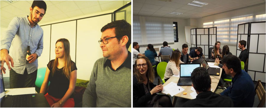
Team
This project was our first concrete implementation of an Agile Scrum method in our workflow. At this occasion we were accompanied by Stephane Langlois, which I say a big thank you for his advices and coaching. The team that worked on this project consisted of 6 people. A product owner, a scrum master, 3 back-end devs and myself.
Problem
Based on the collected data we’ve got, user’s abandon rate were high. Also we’ve detected several usability failures along the funnel. Attempts was made in the past to fix these usability failures. Several A/B tests was performed in order to improve users pain points. Despite that, the checkout process needed deep changes to meet our users needs.
Research
To help us along the research phase, we used different supports and methods.
We conducted user researches on the checkout process to learn more about our user’s characteristics, needs, desires and to evaluate their perception of the checkout process. These researches took place in the form of exploratory interviews with our loyal users.
I was leading these reseraches as I was the UX designer on this project.
We used the book of OpQuast group call “Web Quality”. It’s a fantastic book that list more than two hundred best practices around accessibility, navigation, e-commerce, mobile, performances, … These best practices are so ready to use that they helped us to build user stories.
We also used the “E-commerce checkout usability study” from Baymard institute. I discovered it during my technological monitoring on Smashing Magazine by reading an article of Christian Holst, co-author of the study. It’s a strong study delivering usability guidelines on checkout process.
During the SmashingConf Barcelona 16’, I had the occasion to meet Christian Holst, to speak about his study. Someone very accessible.
Approach
Redesigning the checkout process without suspending website’s activity was mandatory. In an agile approach, we decided to deliver continuously with a first minimum viable product that aimed to perform a complete purchase process with minimum functionality required. To focus our efforts, LEAN method have also allowed us to establish a clear objective:
A user who's not used to purchase online must simply and confidently made a purchase on our website.
Design and development
I was the UX designer and front-end developer of this project. I had the responsabilities to design, do usability tests and develop responsive front-end application of the checkout process redesign. As a team, I also worked closely with the product owner to help create user stories in a fast paced workflow.
For the UX designer role, I followed design thinking and LEAN UX methods.
I let the design emerged as the user stories were presented and then I iterate with user feedbacks to make sure that their needs was fulfilled. During each sprint, I made my sketches on a white board to allow stakeholders and back-end developers participate in the design process of each user stories.
For my front-end developer role, my stack choice was made to allow back-end developers be more comfortable with languages used in front.
Demo prototypes
As a demonstration of the checkout process, you can find simples prototypes setted-up on my Marvel account. This a prototype Saas solution I’m using for share my sketches with co-workers.
Checkout steps block
This is an example of how a user story was developed.
First, the Product owner come with a story that we could interprete as a need, a “why”.
As a buyer I may know where I am in my cart to be reassured on the next step.
The team answer with a “how”. And to begin I sketch something :

When a version is selected, I build the HTML/CSS component :
See the Pen Snippet - Checkout steps block by FrontEnd Matt (@mathieu_fortune) on CodePen.
After back-end developers has implemented the functionnality in the synfony project, the product owner and I test on users and stakeholders their behaviors about this feature.
Progressive enhancement
When I’m building a web site, I don’t assume that every users have Javascript enabled, are using the latest and shiniest web browser or have an ideal bandwidth situation. As such, I take a progressive enhancement approach to design and develop interfaces. Moreover when that match with the MVP goal saw in the approach section below.
So I started each user story with the basic markup, basic style and barely no javascript. This allow the team to focus on solid foundations for each functionalities and then iterate to enhance the experience.
For example, the quantity modifier was firstly design with a “apply” button and then with automatic apply with javascript. It would appear obvious but the last version of the checkout process cannot be used without javascript and even worse when internet explorer crashed because of a Javascript error.
Usability tests
I wrote an article about the UX workshop I co-organized. At this occasion, the checkout process was tested by users and we gathered really interesting feedbacks. Find out more here.